General Font Tips

Sometimes having a few tips on fonts can make it easier to decide what font to go with. I already had a post on fonts Here that covers general font info. Today I’ll talk about choosing fonts for a project and offer a few more tips.

When to use Serif vs Sans-Serif…

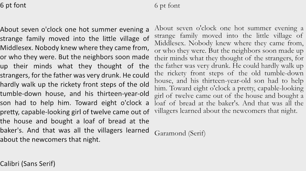
For book projects it’s often recommended to stick with serif typefaces when dealing with a lot of text, it’s supposed to be “easier to read“, though not on “small devices“. This is often quoted from old research that is still debated. For further research on why I think serif does not improve reading compared to sans-serifs check out the link below and decide what you think about it.

Which Are More Legible: Serif or Sans Serif Typefaces?

The old research had numerous flaws, couple this with accessibility issues means I can’t recommend serif fonts as a default automatically.

Accessibility

Those with disabilities such as Dyslexia would say the opposite about serifs, stay far away from serif typefaces and focus on sans-serif. Special fonts like Dyslexie and OpenDyslexic were created for that purpose, to be easy to read.

I find those fonts (Dyslexia, etc) a bit hard to read myself and with over 7 studies it has yet to be proven effective. Considering Dyslexia is mostly a neurological issue, generally, visually changes won’t help but perhaps it makes the page more fun and inviting which might encourage readers. One of the big issues for me with those fonts is the contrast with those fonts, but it might just be poor website design.

Now, while sans-serif fonts might not help with dyslexia. It is considered a way to help those who are visually impaired. Common fonts such as Times New Roman, Verdana, Arial, Tahoma, Helvetica, and Calibri are recommended by the US Department of Health and Human Services for disabilities, notice it’s a mix between serif and Sans-serif? These fonts are common on the web and in print, they also pass the No Coffee test better because of their simplicity, or at least the sans-serif one does. You can try this vision simulator if you want to learn a little more.

What was most helpful for all readers was increasing white space on the page so keep that in mind for accessibility. No matter what font, spacing is important.

Typeface Stereotypes

Serif typefaces are often considered more authoritative, professional, clinical, institutional, historical and elegant. Some popular serif fonts would be Georgia, Garamond, Times New Roman, and Baskerville.

Sans-serif are often considered cutting-edge design, modern, childlike, contemporary, approachable, personal, and clean. Some popular fonts would be: Arial, Candara, Century Gothic, Roboto, Loto, and Verdana.

Can you use a serif typeface in a childlike way? Of course. Can you use sans-serif for something professional? Of course. There are no true hard set rule which typeface must be used and for what purpose, for example…

Trying to find his way out, Bilbo went on down to the roots of the mountains, until he could go no further. At the bottom of the tunnel lay a cold lake far from the light, and on an island of rock in the water lived Gollum. He was a loathsome little creature: he paddled a small boat with his large flat feet, peering with pale luminous eyes and catching blind fish with his long fingers, and eating them raw. – A random quote from The Fellowship of the Ring.

Do not meddle in the affairs of Wizards, for they are subtle and quick to anger. – J. R. R. Tolkien

You’ll notice how I mix serif and sans-serif through all my blog posts, personally, I like that look. I have a soft children’s Sans-serif font Abeezee and a more formal serif font for the rest. It’s all just personal preference in my opinion.

Now does a certain typeface save space? I would say no.
Opening quote from The Boxcar Children.
Quote from Alice In Wonderland showing these different typefaces at size 3 pt.
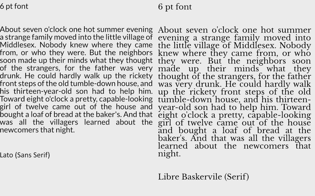
Which one is more readable to you?
When in doubt, test your typefaces and see if your users like them. If you need to save space just try different fonts within the same typeface until you find something that works for you.

What Font Sizes Should You Use?

In general 8 to 12 point (pt) is standard for print materials with most leaning towards 12 point. Headers tend to add 2,4,6,8 more pts to that depending on the size. There is a system you can use for a range of font sizes though called…

Modular Scale Font Sizes

There is a system out there called Modular Scaled fonts, you can use this to find the ideal size of fonts or play around with different font sizes to see how they look.

For websites it’s recommended to stick within these ballpark of sizes: 8, 16, 24, 32, 48, 64, 95

But with modular font sizes you can adjust to fit the needs of whatever platform you are working on.
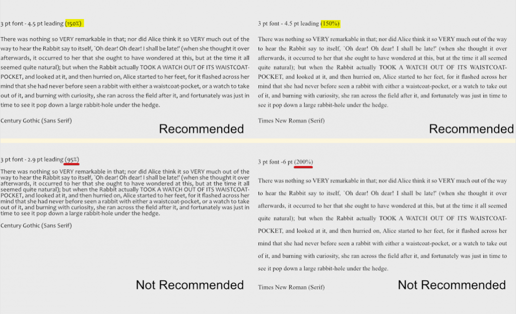
Leading Sizes

As far as line-height(leading) itself goes there is apparently a magic number of 150% that seems to do the trick to make most things presentable. So if your font size is 8 then 8 x 1.5 = 12 leading, again for 12 then your leading should be 18. Now this doesn’t always work, but it can be a starting point if you are unsure of where to start.

Accessibility

There is a design standard for font sizes found on W3C. This can help with choosing font sizes.

In short:

  • Line height (line spacing) to at least 1.5 times the font size; (magic number from above) ⬆️
  • Spacing following paragraphs to at least 2 times the font size;
  • Letter spacing (tracking) to at least 0.12 times the font size;
  • Word spacing to at least 0.16 times the font size.

White Space

White space does a lot for a design. It brings clarity, and elegance. It’s bold and thoughtful. It makes things easier to read and naturally will organize a page.

It can add a touch of elegance.
Or call to action.

It can highlight information.Just like this.

It puts less stress on the reader and leads to longer view times. It also can improve comprehension by almost 20%. So be generous with white space when you can. Don’t be ridiculously generous though, some sites out there space stuff so generously it slows you down to scroll through. Also white space doesn’t need to be white, black or blue as anything else can serve as white space. White space is just about proper spacing.

Font Properties

How many fonts or font colors should you have in your product? It depends but less is more. I suggest generally sticking to 1-3 colors is ideal, and up to 4 fonts for headers, paragraphs, quotes etc is recommended.

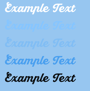
Also remember that contrast makes a lot of difference. When choosing text colors make sure to check if they have enough contrast. There are tools out there that help such as WCAG and other tools. Some tools even help generate color palettes that may help. Also consider that screens will have different color settings, brightness settings and contrast settings that can throw off colors, check your colors on different screens if you must use lower contrast colors. Remember when possible to try to not use color to convey all meaning, in fact that’s a web design standard now, add other ways to express meaning such as bolding text or changing font sizes to help convey what you need to. For a few more ideas on designing with accessibility in mind check out this article.

Examples of high and low contrast.

A Collection of Free Design Books

Are you looking for some design books to read this summer? Well, to my surprise I found a huge assortment online, completely FREE. Wow, I was rather surprised as there are quite a lot of famous books in here. Why not check it out yourself?

First I have to mention this site called freeuxbooks, sounds kinda shady though right? I mean these can’t really all be legit free? Well, I was able to download a few books off it without any real issue. They all are linked to this website called Academia which is for research papers. I’m not exactly sure how that works with copyright though, but considering some of these books were made from blogs, I think they may have something… Though, it still is a little fishy, correct me in the comments if I’m wrong!

Anyway FreeUXBooks has a list of books available: The Design of Everyday Things, Don’t Make Me Think, 100 Things Every Designer Needs to Know About People, and more.

There are also a variety of resources outside of that. UXplanet posted a variety of free resources here. I posted some below that look interesting they are fully web-based so enjoy and meant to be shared. This page really promotes sharing too.

Also free online
More free books

Not sure if it’s legit either… But it seems most design books are now available…

The Non Designers design book

Universal Principles of Design

The Best Interface is No Interface

So if you are looking for a book, perhaps just see what Google can find for you. And if you want the latest trends why not look at research groups?

If you are just looking for a quick UX refresher why not check out the Laws of UX?

Project Management Basics

I’ve decided to cover the basics of project management here. I did not get into any big technical tools but just covered the 3 things you should know before committing to a project.

The 3 things would be defining your goals, understanding your resources, and understanding why projects fail.

1. What are your goals? (Why & Who)

I think this is something honestly most people don’t want to think about. It’s far more exciting to just start building out some project and seeing where it takes you then to stop and ask Why you are building. I’m guilty of skipping this step often because just starting a project can be a lot of fun. Figuring out Who you are building for will help you focus a project. I’m going to just for the sake of simplicity break this down into three parts.

Do you want to sell this project? Then focus on what people want to buy. Look at your competition and see why they are successful and why they failed. Tools like SWOT (Strength, Weakness, Opportunities, Threats) can be a quick way to do this, alongside Competitor Analysis.

Is this just a showcase piece? Then focus on what types of strengths this brings to your portfolio. Think about why these pieces are important and who you want to see them. Showcase pieces are really the middle ground between a product for sell (yourself/team/tool/whatever) and doing something to learn. Getting feedback on showcase pieces is a good way to grow.

Are you doing this to learn/have fun? Sometimes being willing to play and learn is the best way to grow. There are two approaches to this I see. One is to follow tutorials, and learn how to think about a project, the other is to try and built it yourself and learn to how to do creative problem-solving. There are benefits to both methods and realizing the value of both methods helps keep you from getting burnt out or stuck.

2. What are your resources & scope? (How, What & When)

I think the how is something we often assume, or at least I do. I think being able to take a step back and look over the scope of what I want to achieve is important. Do I want to spend a weekend doing this or the next 5 years? What will I need to get this done? What am I willing to give up to make this happen is also something to consider, if you don’t have a lot of time either scope or cost will have to increase to try and maintain quality for example.

As someone who has hired contractors to work under me before, I can tell you, that triangle is a pain. Balancing my budget, my time and scope can be a huge headache.

How to approach project management

Some ways people approach scoping projects is with different mindsets such as Minimum Viable Product (MVP) – a way to create the most basic product necessary for feedback.

Another method becoming more common is creating products with the Minimum Marketable Feature (MMF) mindset, the idea is what is the minimum I need to sell this product.

The difference between MVP and MMF is one (MVP) is focused on prototyping (often for shareholders), the other is focused on being just good enough quality to sell (directly to consumers), so it’s beyond a basic prototype.

These two tools – MVP and MMF are based off of the Agile mindset.

Agile is a project management style of separating tasks and working on them in short sprints then getting feedback. Often these short bursts of work are around 1-4 weeks long but they can be longer or shorter depending on needs. Agile is great for projects with independent components such as one person changing the menus art and another person programming them. Agile doesn’t very work for dependent components though, Waterfall is used then.

Waterfall is very common in art-focused fields where you have to go step by step. If you don’t have a script you can’t design a character, if you don’t have a character you can’t create animations, and every step is dependent on the step before it. It becomes VERY hard to change directions with Waterfall systems, with Agile it is much easier. Neither is wrong, they just serve two different purposes.

In a nutshell if you have a set vision the waterfall method is very likely what you need, if you want feedback from outsiders then agile is better suited.

Because waterfall methods are so vision focused they have a very high failure rate compared to agile projects. Movies flop all the time and it’s important to understand why.

3. Where do projects fail? Back-up’s, design and technical debt

When it comes to creating products design is key. With Waterfall, product design is done in preproduction and does not really change, so the design needs to be really really strong. Agile products can have some weaker designs in the beginning but they have to build up a reasonable design early or else they may suffer technical debt long term.

Technical debt can lead to redoing work, throwing away work and/or poor quality with unfixable bugs or designs. You can avoid or manage technical debt by working on good design practices, such as having good documentation, testing designs (through prototyping and other forms of testing), strong collaboration and refactoring & cleaning up the project as you go.

Some systems that can help with this is source/ version control. Good source control makes it easy to roll back changes if they cause issues which allows for more experimenting & cleaning, it makes collaboration easier, and most have built-in ways to leave documentation of what you have done. Don’t mistake this documentation for proper project design though.

Another tool that really helps is design documents. There are a lot of types of design docs such as Game Design Docs (GDD), Developer style guides, Visual/brand style guides, Model Sheets, business plans among other forms of technical design. These documents help explain what the product is and define the requirements for the product, though in many cases they may be guidelines they are very important if you want to explain (or remember) what makes your product what it is.

Anyway to sum it up..

  • Think about who your audience is
  • Think about why you are building the project
  • Think about what resources you have
  • Think about how you will scope the project & when you plan to finish
  • Think about where you struggle and what tools/outside resources you can use to overcome that.

Designing Good UI/UX is Hard

For those looking for a brief UI overview for small projects, a UI Stylesheet works alright. It’s not as fancy as a full on style guide but for smaller projects it may be what you need as you work out different UI ideas. If you are working on anything longer then 2 weeks, I recommend building a style guide or else you will very likely suffer.

  1. Having a style guide gives you a clear vision of why you made these decisions, this reduces debate.
  2. It’s nice to have a document to refer back to 6 months later when you aren’t sure what size this box was or what color you used on an icon..
  3. You have guidelines ready for if you add new teammates!
  4. I personally think the history of the design is an important aspect to add to the guide unless you can expect the specs and requirements to never change on the project.
  5. Creating a guide alongside with UX reasoning also helps you understand why your UI is laid in the way it is.

While working on Roguecraft Squadron (An RTS computer game) I went through many many many many different versions of UI. It was hard for me to see the big picture or what direction we should go in because the gameplay was not fleshed out all the way. Another issue was the speed of development. Originally this game was built in 3 days so the UI was choppy and very light. I didn’t know back then about better ways to think about development.

I did not know how to design for long term projects and that made designing UI very challenging.

Original 3 day game prototype. All art above is my mine. Photo from Feb 2017

I was thinking after the 3 day game jam, since we were so successful, we should continue development on the game. We continued to do so and did user testing at a local game meetup’s among other places. We would have people play and we would try to figure out ways to improve the game and make it more fun. While our user testing with formal experience was limited, we made the best of it. We would basically sit a user down and watch them play and ask them questions were they struggled.

This was April 2017. We tried to add in a tutorial, it would be a few more years before we figured out how to do it right.

I was still learning how to create UI during this process, and things such as 9 slicing. Since this was built in the LÖVE Framework it was much more restricted then something like as the Unity Game Engine that has a interface I can work with. While I could build designs, the feasibility of designs was limited because of time constricts and limits within the framework.

Me fiddling about with 12 slices here…

Now as I worked on changing UI throughout the process I realized had we just decided on a style and covered constraints early on it would have saved a lot of frustration in the process. Towards the end we ended up stripping out any fancy effects I had in mind and keeping it very basic so we could finish the project.

The UI in the end – Feb 2019. Very stripped down and purely function over style.
This was further worked on, as you can see the ship now had a selector, and the layout was overhauled
Now you might ask yourself what is a stylesheet?

A stylesheet is a way to glance over all your visual elements so you can see if they work together. I can’t remember the original creator of the this PS stylesheet template but I liked the idea. It was a way to quickly compare elements and see if they worked together. A quick mock-up so to speak. The idea is to test colors, patterns, fonts and other styles together to see if they work together. You can then create different styles and compare them.

Here is an example I made of a stylesheet for Stellaris. I was not part of the team this is just an example.
Here is an example I created during the pre-production of a game I was working on later on.
Here I was trying to make sense of what the game had become!

Well near the end as we decided to overhaul the UI to a simple version then I went about trying to make sense of the UI. At that point colors were random and did not work well together and things were becoming hard to understand, the other problem was we introduced new artists that didn’t understand our UI guidelines (Maybe because we didn’t have any then??) so the art we received was completely in the wrong style. If you work on a project for a few years without proper planning – original designs and plans get muddled. Sometimes the worse thing you can do is continue to try and improve something in your current direction.

What I would recommend if I were to fix this – Ask 3 important questions

  1. First separate out the elements, compare them to one another. Do the UI elements feel like they fit together? Do they all share similar styles, sizes and color schemes? What doesn’t fit? What does fit? Does spacing and size feel right? I feel that spacing and sizing of our UI could have used work. As the art we received from two new artists did not fit but I couldn’t argue that out of the project as it was already commissioned for and we didn’t want people to feel bad.
  2. Second, can you tell what the theme is from the color scheme? Why are the colors chosen? What is the meaning behind the colors? I think overall our UI colors worked but could have been more focused.
  3. Third – do the elements themselves feel like they belong with the rest of the content? (The game in this case). In the last version of our UI I would say no. The rest of the game is detailed, but the UI is strangely not. It doesn’t feel connected to the world in my opinion.

Using this process I believe we could have worked out a UI that felt better connected to the game.

There were numerous time constricts with the design and what the programmers could do so sometimes you just have to let it go and just find doable fixes the programmer will okay for your deadline.

If you want to see behind the scenes on some of the ideas for the UI why not look at the notes on GitHub?

Here you can see the crazy design process on RCS. Design is messy, frustrating, and getting a win like getting the programmer to add a UI back button can really feel like a victory (I mean I really fought for a back button on all the main screens, it was like not until we were going to release 2 years later we added one).

Here you can see my journey of learning how to write better tickets, create better designs, and figure out better project management. Lots & lots of mistakes but I slowly learned how to improve. Not everything is here but here are a few examples of stuff I’ve worked on.

I never claimed to be a good designer and I sure learned a lot over a few years working with designing screens. What I learned most of all is…

Use a style guide next time!
A part of me would like to write a guide on a style guide for RCS sometime when I have more free time. Considering this has been a pet project for so many years, it’s nice to work on in my free time but I always have so many other projects going on, we’ll see when it happens.
Smiling Cat Media