Sometimes having a few tips on fonts can make it easier to decide what font to go with. I already had a post on fonts Here that covers general font info. Today I’ll talk about choosing fonts for a project and offer a few more tips.
When to use Serif vs Sans-Serif…
For book projects it’s often recommended to stick with serif typefaces when dealing with a lot of text, it’s supposed to be “easier to read“, though not on “small devices“. This is often quoted from old research that is still debated. For further research on why I think serif does not improve reading compared to sans-serifs check out the link below and decide what you think about it.
Which Are More Legible: Serif or Sans Serif Typefaces?
The old research had numerous flaws, couple this with accessibility issues means I can’t recommend serif fonts as a default automatically.
Accessibility
Those with disabilities such as Dyslexia would say the opposite about serifs, stay far away from serif typefaces and focus on sans-serif. Special fonts like Dyslexie and OpenDyslexic were created for that purpose, to be easy to read.
I find those fonts (Dyslexia, etc) a bit hard to read myself and with over 7 studies it has yet to be proven effective. Considering Dyslexia is mostly a neurological issue, generally, visually changes won’t help but perhaps it makes the page more fun and inviting which might encourage readers. One of the big issues for me with those fonts is the contrast with those fonts, but it might just be poor website design.
Now, while sans-serif fonts might not help with dyslexia. It is considered a way to help those who are visually impaired. Common fonts such as Times New Roman, Verdana, Arial, Tahoma, Helvetica, and Calibri are recommended by the US Department of Health and Human Services for disabilities, notice it’s a mix between serif and Sans-serif? These fonts are common on the web and in print, they also pass the No Coffee test better because of their simplicity, or at least the sans-serif one does. You can try this vision simulator if you want to learn a little more.
What was most helpful for all readers was increasing white space on the page so keep that in mind for accessibility. No matter what font, spacing is important.
Typeface Stereotypes
Serif typefaces are often considered more authoritative, professional, clinical, institutional, historical and elegant. Some popular serif fonts would be Georgia, Garamond, Times New Roman, and Baskerville.
Sans-serif are often considered cutting-edge design, modern, childlike, contemporary, approachable, personal, and clean. Some popular fonts would be: Arial, Candara, Century Gothic, Roboto, Loto, and Verdana.
Trying to find his way out, Bilbo went on down to the roots of the mountains, until he could go no further. At the bottom of the tunnel lay a cold lake far from the light, and on an island of rock in the water lived Gollum. He was a loathsome little creature: he paddled a small boat with his large flat feet, peering with pale luminous eyes and catching blind fish with his long fingers, and eating them raw. – A random quote from The Fellowship of the Ring.
You’ll notice how I mix serif and sans-serif through all my blog posts, personally, I like that look. I have a soft children’s Sans-serif font Abeezee and a more formal serif font for the rest. It’s all just personal preference in my opinion.
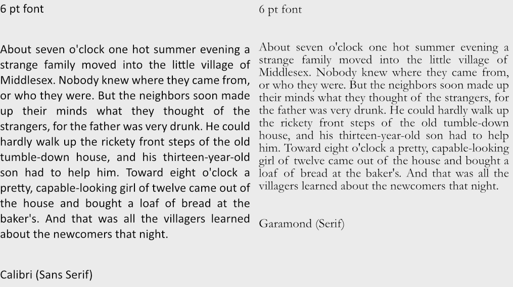
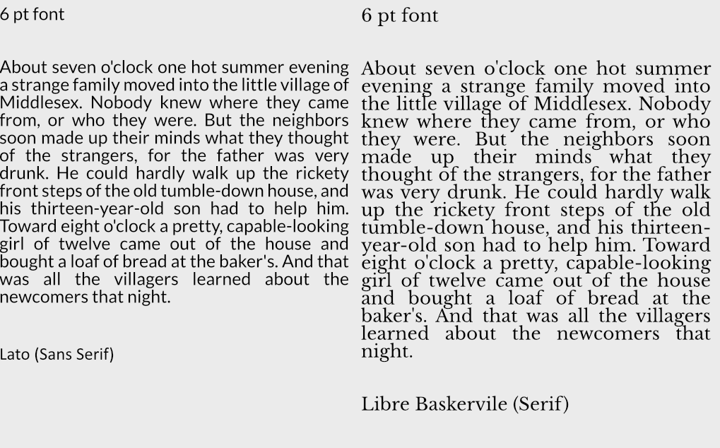

Which one is more readable to you?
What Font Sizes Should You Use?
In general 8 to 12 point (pt) is standard for print materials with most leaning towards 12 point. Headers tend to add 2,4,6,8 more pts to that depending on the size. There is a system you can use for a range of font sizes though called…
Modular Scale Font Sizes
There is a system out there called Modular Scaled fonts, you can use this to find the ideal size of fonts or play around with different font sizes to see how they look.
For websites it’s recommended to stick within these ballpark of sizes: 8, 16, 24, 32, 48, 64, 95
But with modular font sizes you can adjust to fit the needs of whatever platform you are working on.
Leading Sizes
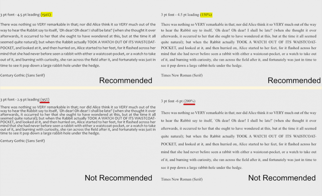
As far as line-height(leading) itself goes there is apparently a magic number of 150% that seems to do the trick to make most things presentable. So if your font size is 8 then 8 x 1.5 = 12 leading, again for 12 then your leading should be 18. Now this doesn’t always work, but it can be a starting point if you are unsure of where to start.
Accessibility
There is a design standard for font sizes found on W3C. This can help with choosing font sizes.
In short:
- Line height (line spacing) to at least 1.5 times the font size; (magic number from above) ⬆️
- Spacing following paragraphs to at least 2 times the font size;
- Letter spacing (tracking) to at least 0.12 times the font size;
- Word spacing to at least 0.16 times the font size.
White Space
White space does a lot for a design. It brings clarity, and elegance. It’s bold and thoughtful. It makes things easier to read and naturally will organize a page.
It can add a touch of elegance.
Or call to action.

It puts less stress on the reader and leads to longer view times. It also can improve comprehension by almost 20%. So be generous with white space when you can. Don’t be ridiculously generous though, some sites out there space stuff so generously it slows you down to scroll through. Also white space doesn’t need to be white, black or blue as anything else can serve as white space. White space is just about proper spacing.
Font Properties
How many fonts or font colors should you have in your product? It depends but less is more. I suggest generally sticking to 1-3 colors is ideal, and up to 4 fonts for headers, paragraphs, quotes etc is recommended.

Also remember that contrast makes a lot of difference. When choosing text colors make sure to check if they have enough contrast. There are tools out there that help such as WCAG and other tools. Some tools even help generate color palettes that may help. Also consider that screens will have different color settings, brightness settings and contrast settings that can throw off colors, check your colors on different screens if you must use lower contrast colors. Remember when possible to try to not use color to convey all meaning, in fact that’s a web design standard now, add other ways to express meaning such as bolding text or changing font sizes to help convey what you need to. For a few more ideas on designing with accessibility in mind check out this article.
