General Font Tips

Sometimes having a few tips on fonts can make it easier to decide what font to go with. I already had a post on fonts Here that covers general font info. Today I’ll talk about choosing fonts for a project and offer a few more tips.

When to use Serif vs Sans-Serif…

For book projects it’s often recommended to stick with serif typefaces when dealing with a lot of text, it’s supposed to be “easier to read“, though not on “small devices“. This is often quoted from old research that is still debated. For further research on why I think serif does not improve reading compared to sans-serifs check out the link below and decide what you think about it.

Which Are More Legible: Serif or Sans Serif Typefaces?

The old research had numerous flaws, couple this with accessibility issues means I can’t recommend serif fonts as a default automatically.

Accessibility

Those with disabilities such as Dyslexia would say the opposite about serifs, stay far away from serif typefaces and focus on sans-serif. Special fonts like Dyslexie and OpenDyslexic were created for that purpose, to be easy to read.

I find those fonts (Dyslexia, etc) a bit hard to read myself and with over 7 studies it has yet to be proven effective. Considering Dyslexia is mostly a neurological issue, generally, visually changes won’t help but perhaps it makes the page more fun and inviting which might encourage readers. One of the big issues for me with those fonts is the contrast with those fonts, but it might just be poor website design.

Now, while sans-serif fonts might not help with dyslexia. It is considered a way to help those who are visually impaired. Common fonts such as Times New Roman, Verdana, Arial, Tahoma, Helvetica, and Calibri are recommended by the US Department of Health and Human Services for disabilities, notice it’s a mix between serif and Sans-serif? These fonts are common on the web and in print, they also pass the No Coffee test better because of their simplicity, or at least the sans-serif one does. You can try this vision simulator if you want to learn a little more.

What was most helpful for all readers was increasing white space on the page so keep that in mind for accessibility. No matter what font, spacing is important.

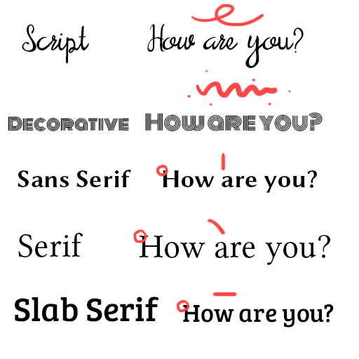
Typeface Stereotypes

Serif typefaces are often considered more authoritative, professional, clinical, institutional, historical and elegant. Some popular serif fonts would be Georgia, Garamond, Times New Roman, and Baskerville.

Sans-serif are often considered cutting-edge design, modern, childlike, contemporary, approachable, personal, and clean. Some popular fonts would be: Arial, Candara, Century Gothic, Roboto, Loto, and Verdana.

Can you use a serif typeface in a childlike way? Of course. Can you use sans-serif for something professional? Of course. There are no true hard set rule which typeface must be used and for what purpose, for example…

Trying to find his way out, Bilbo went on down to the roots of the mountains, until he could go no further. At the bottom of the tunnel lay a cold lake far from the light, and on an island of rock in the water lived Gollum. He was a loathsome little creature: he paddled a small boat with his large flat feet, peering with pale luminous eyes and catching blind fish with his long fingers, and eating them raw. – A random quote from The Fellowship of the Ring.

Do not meddle in the affairs of Wizards, for they are subtle and quick to anger. – J. R. R. Tolkien

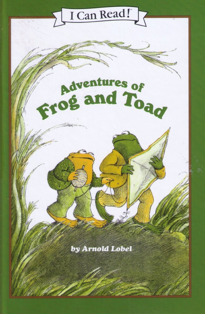
You’ll notice how I mix serif and sans-serif through all my blog posts, personally, I like that look. I have a soft children’s Sans-serif font Abeezee and a more formal serif font for the rest. It’s all just personal preference in my opinion.

Now does a certain typeface save space? I would say no.
Opening quote from The Boxcar Children.
Quote from Alice In Wonderland showing these different typefaces at size 3 pt.
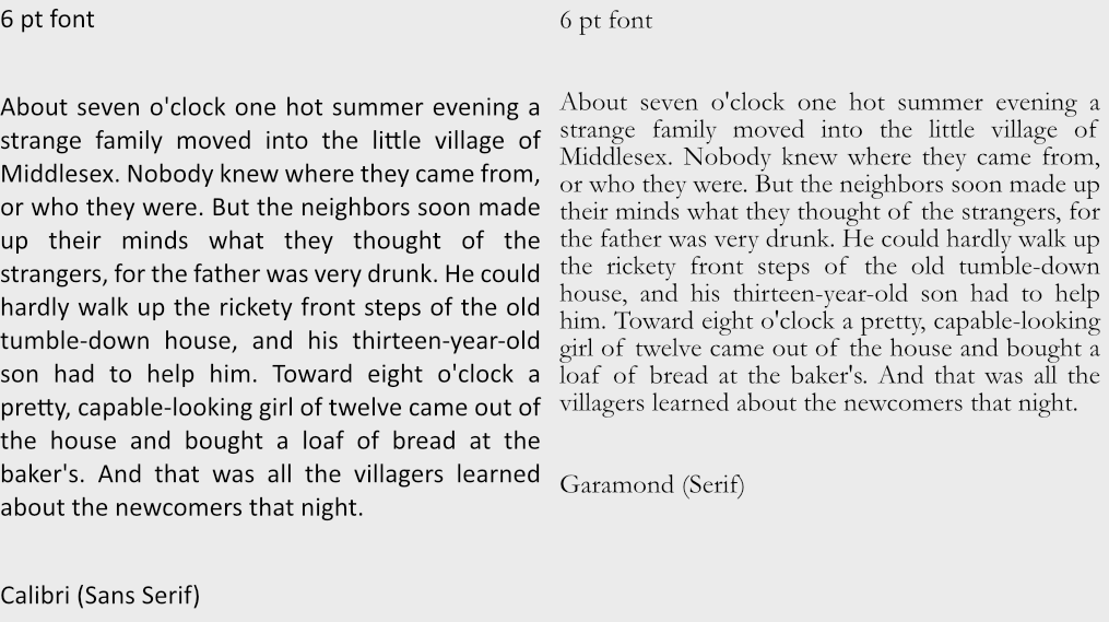
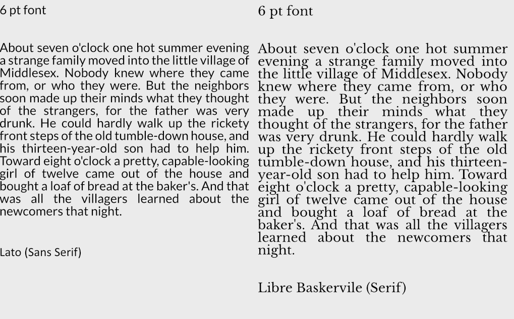
Which one is more readable to you?
When in doubt, test your typefaces and see if your users like them. If you need to save space just try different fonts within the same typeface until you find something that works for you.

What Font Sizes Should You Use?

In general 8 to 12 point (pt) is standard for print materials with most leaning towards 12 point. Headers tend to add 2,4,6,8 more pts to that depending on the size. There is a system you can use for a range of font sizes though called…

Modular Scale Font Sizes

There is a system out there called Modular Scaled fonts, you can use this to find the ideal size of fonts or play around with different font sizes to see how they look.

For websites it’s recommended to stick within these ballpark of sizes: 8, 16, 24, 32, 48, 64, 95

But with modular font sizes you can adjust to fit the needs of whatever platform you are working on.
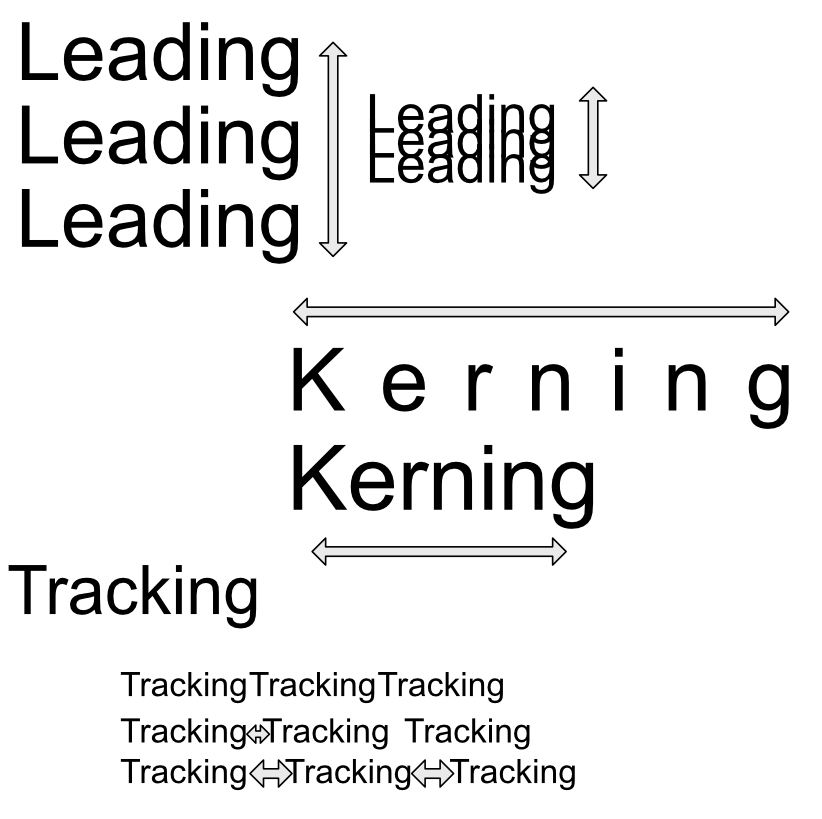
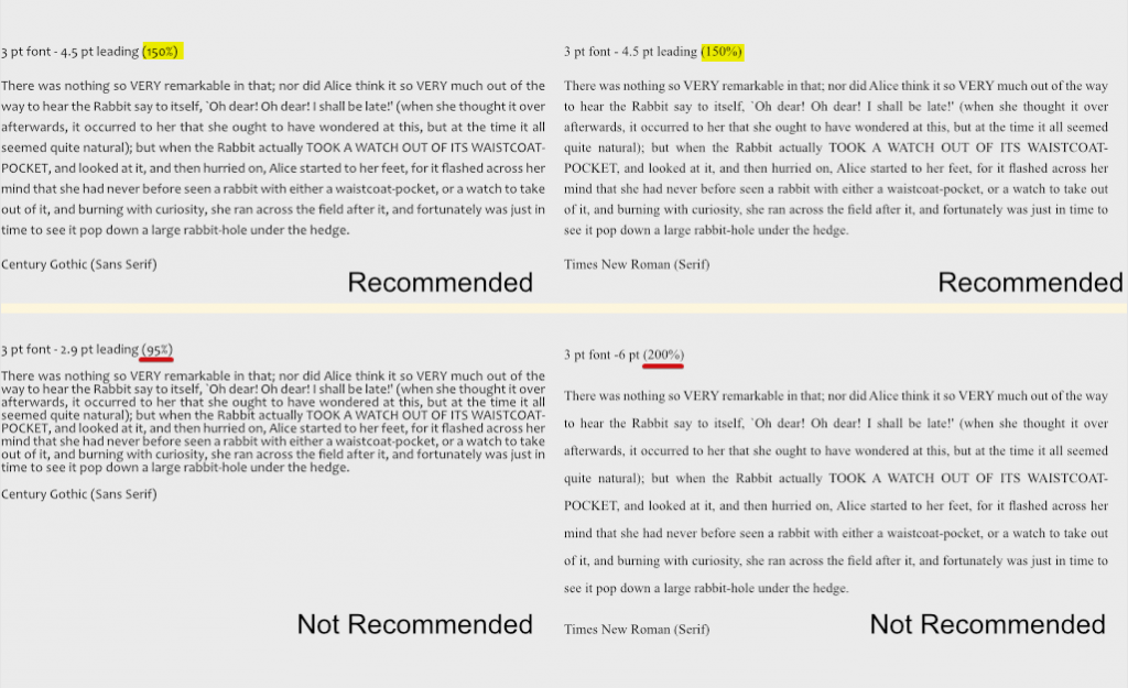
Leading Sizes

As far as line-height(leading) itself goes there is apparently a magic number of 150% that seems to do the trick to make most things presentable. So if your font size is 8 then 8 x 1.5 = 12 leading, again for 12 then your leading should be 18. Now this doesn’t always work, but it can be a starting point if you are unsure of where to start.

Accessibility

There is a design standard for font sizes found on W3C. This can help with choosing font sizes.

In short:

  • Line height (line spacing) to at least 1.5 times the font size; (magic number from above) ⬆️
  • Spacing following paragraphs to at least 2 times the font size;
  • Letter spacing (tracking) to at least 0.12 times the font size;
  • Word spacing to at least 0.16 times the font size.

White Space

White space does a lot for a design. It brings clarity, and elegance. It’s bold and thoughtful. It makes things easier to read and naturally will organize a page.

It can add a touch of elegance.
Or call to action.

It can highlight information.Just like this.

It puts less stress on the reader and leads to longer view times. It also can improve comprehension by almost 20%. So be generous with white space when you can. Don’t be ridiculously generous though, some sites out there space stuff so generously it slows you down to scroll through. Also white space doesn’t need to be white, black or blue as anything else can serve as white space. White space is just about proper spacing.

Font Properties

How many fonts or font colors should you have in your product? It depends but less is more. I suggest generally sticking to 1-3 colors is ideal, and up to 4 fonts for headers, paragraphs, quotes etc is recommended.

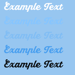
Also remember that contrast makes a lot of difference. When choosing text colors make sure to check if they have enough contrast. There are tools out there that help such as WCAG and other tools. Some tools even help generate color palettes that may help. Also consider that screens will have different color settings, brightness settings and contrast settings that can throw off colors, check your colors on different screens if you must use lower contrast colors. Remember when possible to try to not use color to convey all meaning, in fact that’s a web design standard now, add other ways to express meaning such as bolding text or changing font sizes to help convey what you need to. For a few more ideas on designing with accessibility in mind check out this article.

Examples of high and low contrast.

My Favorite Desktop Programs

Hello there, I thought I’d share some of my favorite programs and why. This is in no particular order, just wanted to make a quick list. I’m a flexible designer so I’ve worked on a variety of projects and my tools reflect that. This post isn’t sponsored (considering half the tools are free and open-source) or anything just wanted to share some tools I really love.

Here is the list if you want to quickly see what I’m covering.

  1. Affinity Designer – Vector software similar to Illustrator
  2. Affinity Publisher – Publishing & page management software similar to InDesign
  3. Clip Studio Paint – Japanese Comic Software (Supports 3D models, includes 1000’s of free assets, etc)
  4. Krita – free awesome digital paint app
  5. Blender – free 3D/2D modeling/sculpting & animation, video editing and FX tool
  6. Screen to Gif – record gif or videos with this free editor
  7. Github Desktop – The artist-friendly way to save your work
  8. Notion – Kanban boards, tables, lists, Wikis, blog posts, Notes & docs, math equations, websites all in one tool.
  9. Unity – For building games

Runner up tools would be Visual Studio Code, Reaper, FontForge, and well probably some other tools I can’t think of at the moment. I don’t really use these tools enough to add them to this list, but I wanted to give them honorable mentions as a code editor, sound editor, and font editor.

Favorite Design Software

Affinity Designer

A competitor to Adobe Illustrator, for one low price of $50 you can own this lovely software perfect for Vector design work or 2D artwork created from points and paths not based on raster pixels but perfectly calculated curves and lines.

Affinity Designer works on Mac, Windows and Ipad
Affinity Design example of Vector lines on the right and Pixel Live Preview on the left.


Illustrator came out in 1987, and Affinity Designer 2014 (Windows version 2016) and despite the wide gap in years Affinity Design has caught up well and added features Illustrator with its bloated history has not yet received.
The most notable difference is Ease of Use, affinity design makes it easy to get started when working on a design. If you have a few hours you can quickly master Affinity Design.

Some features that Affinity Design has that Illustrator does not is wide file support. Affinity Design also has built-in Persona’s that allow you to easily combine Vector & Vaster images. They also easily allow you to switch a file into any of their software so if you have Affinity Publisher you can easily open up Affinity Design files.

Affinity Design allows unlimited zoom, artboards, undo, and history snapshots. It’s very fast compared to Illustrator but is still missing a few key features such as tracing, mesh tools, blend and knife tools. The filters are lacking as well but for $50 one time vs $250+ per year, it’s worth the price. Many people compare it to CS5 toolset wise which is not bad. My favorite feature would be Power Duplicate which allows me to paste an object at different scales or rotations depending on the last pasted object using Ctrl + C to copy and Ctrl + J to paste with the changes.

Affinity Design alternatives would Inkscape, Illustrator and Gravit… But they just aren’t as good.

Affinity Publisher

Similar to Adobe’s Indesign, Affinity Publisher is available for creating books and print material. It’s easy to use and works well with Affinity Design. I’ve used it to produce three books for print and recommend it as a quick way to work on print production and handle text specifically. It’s still missing a lot of key features but worked well enough for my purposes. Did mention all Affinity software has a spellcheck feature built in?

Here are some books I made with it.

While I could mention Affinity Photo, I still have found Adobe Photoshop to be better overall and haven’t seen a killer feature from Photo that would make me switch but I hope in the future they find a way. I’d like to completely get rid of Adobe at some point.

Clip Studio Paint

It’s built for professionals. If you are looking for a tool that allows you to create comics, books, animations, or anything focused on illustration with a vector attitude this is the software for you. They have an incredible free & paid asset store (Also as an American, the store is super cheap! $20 will last you a good while), amazing brushes, backgrounds and other tools. I recommend this software for artists who are into animation and comics. The downsides is because it is a Japanese product be prepared to work out translating some stuff on the asset store, they have a button to do it for you, but when searching its still good to know to look for 枝 instead of branch as you’ll get better results with the former.
Check it out

Above shows vectors brushes, perspective & ruler tools (they have some amazing tools!), 3D models used to help aid with drawing (I mainly use them for background work) and page management. I think the page management could use a little work but overall it’s great, I use affinity publisher for better page & text management though.

They also allow animation and stuff but the tools are only so-so if you ask me.

Krita

Krita is a great free digital painting & animation tool, it has a lot of special features not found in other art engines. What I use it for most would be it’s filters. It has both Internal and G’MIC filters. And those G’Mic filters! 500+ available filters! It also has the most non-destructive workflow for artists with so many different types of layer options. The reference tool it has is really nice, I wish other companies built something similar. It also has your standard Drawing Assistants, Full Color Management, HDR Painting, Python Scripting, PSD Support, Audio Support for Animation, Customizable onion skinning, and so much more!
I love the how the brush was built to be both a brush and eraser, the Brush Stabilizers are good, as is the Brush Engines, it also has a Wrap-around mode for creating tiles/textures/repeat patterns. 🙂 Great for game art!

How can you not like their cute mascot too?
Use Krita to create fun Animation
Tons of free resources on producing comics for web & print
Check out game art resources with GDQuest

Blender

Blender an all in one tool – 3D modeling, Animation, 2D animation, Video compositing, VFX, Shaders, Sculpting, Python scripting, all in real time. No need to wait for rendering! Not with EEVEE! Super easy to use and work with.

If you have worked with other 3D modeling/animation etc tools, they made made it easier then ever to transition so it’s a great time to try it out now. I use it for a lot of different projects and recommend it if you want to get started with 3D modeling.

So much packed into one free piece of software!
Lots of short 1 min tutorials which you can pick after working with Blender for a month
See, that was easy! 😉

Screen to Gif

Easy to use free open source screen recorder! Check it out. I use this all the time when I want to quickly create a video or gif of my work and sent it to my client, my friend or whoever else. It’s very easy to use and I enjoy using it. Being free is also a big plus. You can record and edit very easily and I wish I could more software that was quite as nice.

Even has a handily editor so you can trim, draw, edit, play etc
I just realized I could export video… ><

Github Desktop

Yay! Source control! Once you understand source control you will never go back! Github Desktop makes it easy to get started. It’s great for working in games as you can upload your files, makes some tweaks, upload it to the server – realize you made a mistake and revert back. 👍 … Or you can zip up your file, make a terrible mistake, and unzip that last file you saved because you made a back-up the old fashioned way.

In all seriousness it’s like the ultimate undo button with comments and notes, the ability to use branches so you can experiment with files before committing them to the repository. And it’s simple enough artists can use this with Unity, or Love or whatever framework/engine/library you want to work with. If you find yourself hating Unity Collab with hair pulling wait times, you’ll love this, skip the wait, have a better history and work without fear!

Notion

Notion. For those of you who are like, man I wish I had something like google docs but like better.. Well this is for you! Make your notes public websites, or make your spreadsheet private, make it easy to share or hide it away.
You want checkboxes next to your spreadsheets and an embedded pdf? They got you covered!

I like the whole Customize Everything part and the Embed your current tools and drag & drop and just the stuff everything in one spot philosophy. I also like the endless templates available… Not that I really use them much but I like that idea. You can use it for Kanban boards, tables, lists, Wikis, blog posts, Notes & docs, complicated math equations, websites and your own private recipe book.

It’s free but I ended up liking it so much I have the $5 plan for unlimited space.

Unity

My go-to game engine. Before I used Unity, I used GameMaker for many years. I loved GameMaker and it was built well for 2D games. I created art software in it and other games but it was limited in that it could not handle 3D very well. I started teaching myself Unity once I got to the point I wanted to understand 3D. I struggled. I hated Unity, in the beginning, I was overwhelmed with C# the first year but eventually figured it out and now C# is my favorite programming language!

I prefer Unity over Unreal mainly because it’s easier to program in right away and because it runs on low end machines better. If you are looking for something more high end Unreal would be the way to go, but if you just want to make Switch or Mobile games, Unity is better suited.

Understanding Typography For Your Project

Understanding a little about fonts and typography can go a long way in describing how you think you text should be handled. Typography is often used to connect the reader to the words, and is important when thinking about the design and what you want to emphasize. Here is a quick overview of of some typography terms to get you started.

First what is a font?

A font is a graphical representation of text that can include letters, symbols, sizes, styles and sometimes even color. Fonts are stored on a computer and allow you to change how your text looks.

Before fonts were stored on a computer they were made of metal and were used to print text and other symbols on a page. A font was composed of sorts or metal pieces placed in a line on a composing stick to create sentences.

Here is an image of an H sort

A collection of fonts is called a typeface or font family. Below is an example of different Imprint fonts in the Imprint typeface. Some Imprint font examples would include Imprint Regular, Imprint Italic, Imprint Bold, Imprint Shadowed and Imprint Shadowed Italic.

Font types

There are a variety of types of fonts out there. Here is a starting point for understanding some main differences, this can be split up further into another 15 categories, but the below should be enough for you to grasp differences in type.

  • Script – Personal Handwriting
  • Decorative – Oddball text that can be a mix of styles or a completely new style
  • Sans serif – Playful geometric text with no overhanging serifs
  • Serif – Soft traditional text with curved overhanging serifs
  • Slab serif – Blocky text with overhanging straight/angular serifs

Spacing

Sometimes text just feels off- a good layout will work to fix spacing issues. Leading is the space between each fonts baseline, you can use leading to fit more or fill out text paragraph height. Kerning is the spacing between letters, to focus on the letters spread them out. Tracking is the space between words, adjusting this can remove orphan words or even out a paragraph. Both kerning and tracking can be used to adjust paragraph width (and sometimes height if orphan words are hanging off the paragraph).

Types of font files on a computer

Before many font options existed something called Adobe’s PostScript (PS) was used to display fonts. It send the data for printing to a printer but was slow and and struggled with some fonts. Apple then stepped in and created TrueType (TTF) and it allowed a lot more freedom with font handling and no longer required the printer to handle the font data, they also created a fair amount of free fonts.

Adobe and Microsoft teamed up to create OpenType (OTF) a file type that extended TTF and added more functionality and storage in the font type. Some of the new functionality included Ligatures, Glyphs, Alternate characters and more.

In a nutshell OTF allows greater control and options for one font and is recommend for more advanced typesetting. You can see more options in software like Photoshop and can avoid installing 3-4 TTF fonts with 1 OTF font.

Another somewhat rarely used font file is a type called OpenType-SVG. It just has some additional color options/image options but not a lot of applications support it so I still don’t recommend it yet. It works fine in Adobe software but outside that it is problematic. The other thing is with so many new options it has it’s draw backs like certain fonts will be pixelated if at the wrong scale unlike traditional OpenType.

Understand Your Audience to Create a Spectacular Children’s Book!

If you ever plan to successfully market your book, the first step is know your market. This beginning step is often forgotten in the thrill of a new project, but it can help turn a mediocre book into something spectacular that stands out from the market and sells well.

To begin, it’s important to think about what age your audience is who reads the book. Books that can be read by a wide range of ages are called cross-over books.

Some common age categories (but are really just guidelines) are as follows:

Board Books

These are a style of book format not a genre, but when most people think of children’s books they think of these. These types of books are hard to publish and cost significantly more then a standard book, hence why they are not published often. The touch and feel books, fabric books, or other types of categories can be wrapped up into this group. These books often have special toys or goodies or boxed sets included, and many are based off of popular picture books.

Early Picture Books

A spread is two pages that face each other

These books are often under 500 words, the standard page count is about 32 pages, roughly 28 actual story. A lot of the story will be told through the pictures so you don’t have to state everything, just be sure to communicate what you want to your illustrator.

Often there is one to two illustrations per page, and about 15 spreads in a typical book.

Standard Picture Books

These books can go over 1,000 words, but rarely do so. Don’t shy away from emotions as many of the best loved books cover a variety of emotions. The most popular emotional themes would be:

Courage, Friendship, Belonging/Identity, Family Loss/Grief, Growing Up, Anger, Suffering, Jealousy, Love

For a list of many classic books that address these emotions check out this Barnes & Nobles list here.

Picture books often use a lot of poetry as they are often meant to be read out loud. Books by Dr.Seuss, Shel Silverstein, and others often create catchy or fun sentences that children love.

Early Readers

Early Readers word ranges between 2,000-5,000 words. Children in this age range are still learning to read chapter books on their own often and often need a little help with extra pictures in the books. Not every page will feature a picture, and pictures are often just black and white, but think of good scenes that be illustrated. It’s important to give these books structure, as early readers are still looking for reading patterns, a beginning, middle and end to stories, and creating a strong character to go through a series makes it easier for them to follow.

Chapter Books

These look more like “grown-up” books and vary in length and pictures, word count ranges between 3,000-15,000 words depending on grade and reading level.

These books are often very gendered, pink fairy books for girls, and blue gross books for boys, those tend to sell the best, but thinking outside the box could tap into an undeserved market.

Popular themes for this age range are: Secrets, Magic, Cuteness, and Rebellion and Naughtiness

Hi-Lo

Hi-lo are high interest-low reading level books. Struggling readers, reluctant readers, dyslexic readers and students who have English as a second language often turn to these books as they written at a lower reading level, but still have interesting material. These books build confidence by being easy to finish with lower word counts, word counts vary between 500-50,000.

Graphic novels could be included in this category as they more accessible then standard books and encourage reading, but often aren’t included in this category.

Middle Grade

Generally only about to 45,000-50,000 words, but fantasy and sci-fi can go beyond those limits. Often these books are about traveling and having fun. You won’t have much adult content like swearing, graphic violence, drugs and romance is light to non existent. Character points of views aren’t as deep as most of the focus is on exploring or light of adventure.

Young Adult

Drama, drama, young adult books focus on emotions. Romance is often important, and a deeper point of view for characters is expected. Plot is not as important as the drama and emotions that run through the story. Word count runs around 70,000, but fantasy and sci-fi are just always higher.

Popular themes are fantasy, science fiction, paranormal, or dystopian stories.

Smiling Cat Media