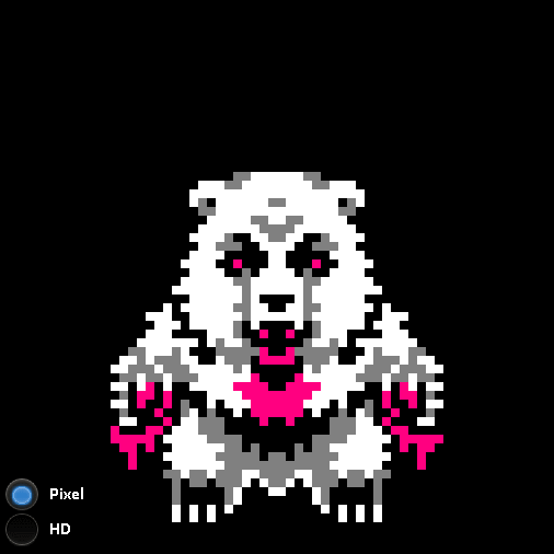
So my friend wanted to create a FPS (First person shooter) to practice networking. I thought this would be a good time to practice rigging and modeling. We sat down a few days ago, went over the design, and I started working on the bird model and rigging for a cowboy themed game. I don’t have a lot of experience in that so my modeling and rigging was pretty slow..
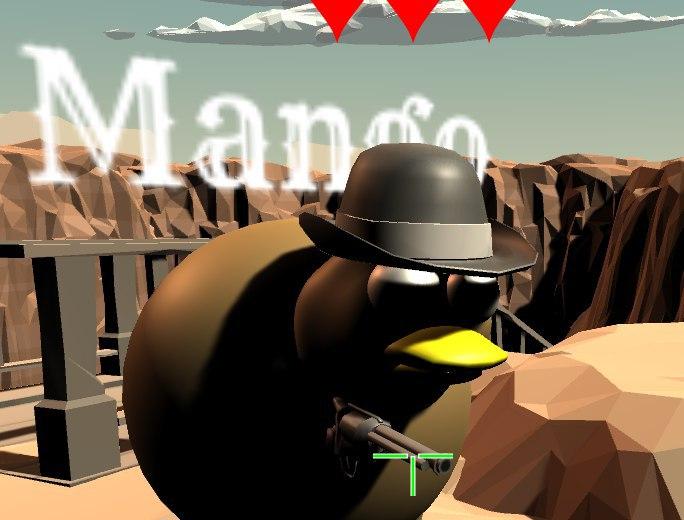
Here is a later model that I was testing it out – I figured I’d redo the model again later, so testing it out would be fine. After spending time learning how to setup IK’s in Blender, I came to realize they don’t work in Unity like I hoped to my disappoint.. There are ways to make them work but they aren’t as easy…
My original goal was to make these awesome sculpted birds all fully rigged and maybe animated. That didn’t really turn out like I hoped, I’m pretty bad at sculpting for one thing and got lost often. My programmer didn’t know how to handle bones and wasn’t exactly happy I requested procedural animation and send them an article on how to implement it. But they said they would look into it.
Anyways!
Even though modeling & rigging takes me forever from my lack of experience, UI is a different story.
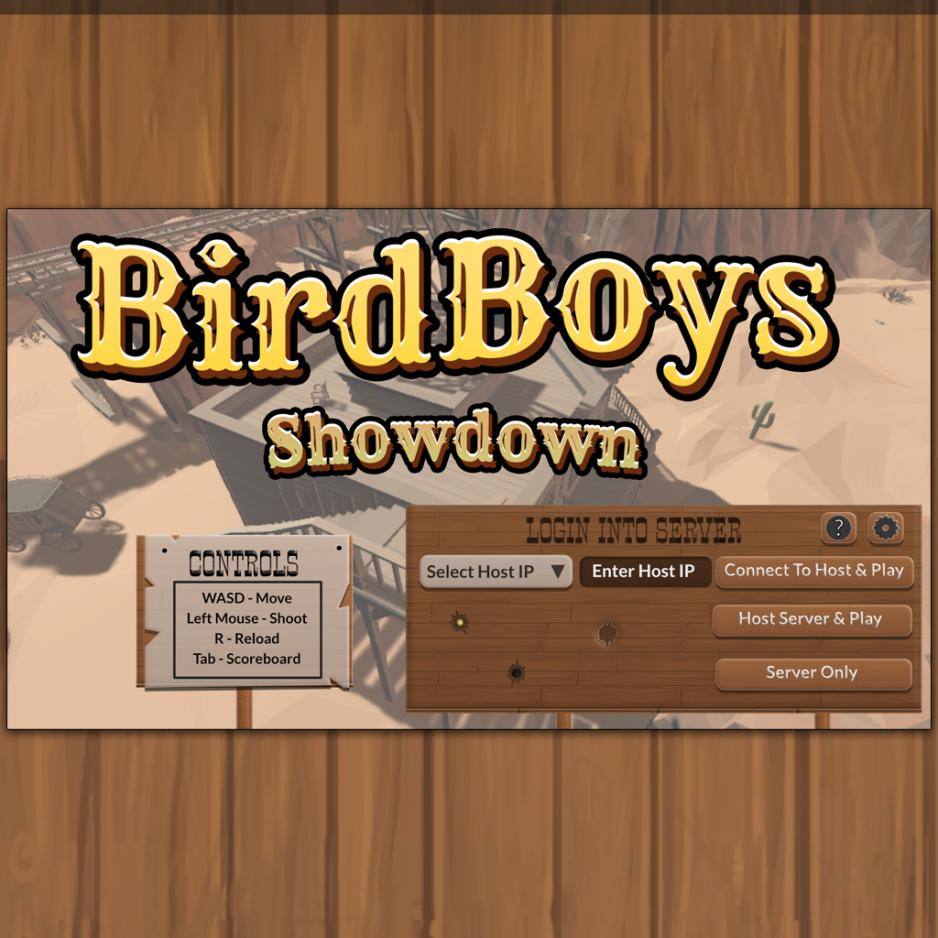
Main Screen
I asked about some requirements, took down some rough notes, stared at what the programmer came up with and panicked for a minute…
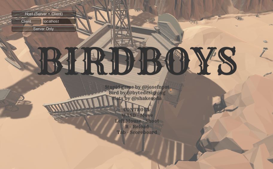
But then I came to my senses and I looked at western UI from other games, I didn’t actually see much I liked but it gave me some ideas on maybe where I could improve. I wanted something cartoony, but with a strong western feel.
So I started a quick mock-up… I actually tried some wireframe tools but found them so slow and painful to use, I just put them away. I like the idea of wireframe tools but if it only takes me an hour or two create some starting assets, it’s just faster for me to mock-up and create at the same time. I thought I’d just skip ahead and in an few short hours I created a starting point for what I wanted the mock-up to look like. I know I’m terrible for not doing concept art/wireframes but sometimes it’s better to make something then be stuck moving boxes around.
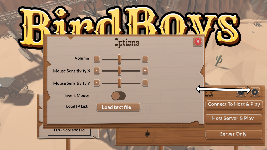
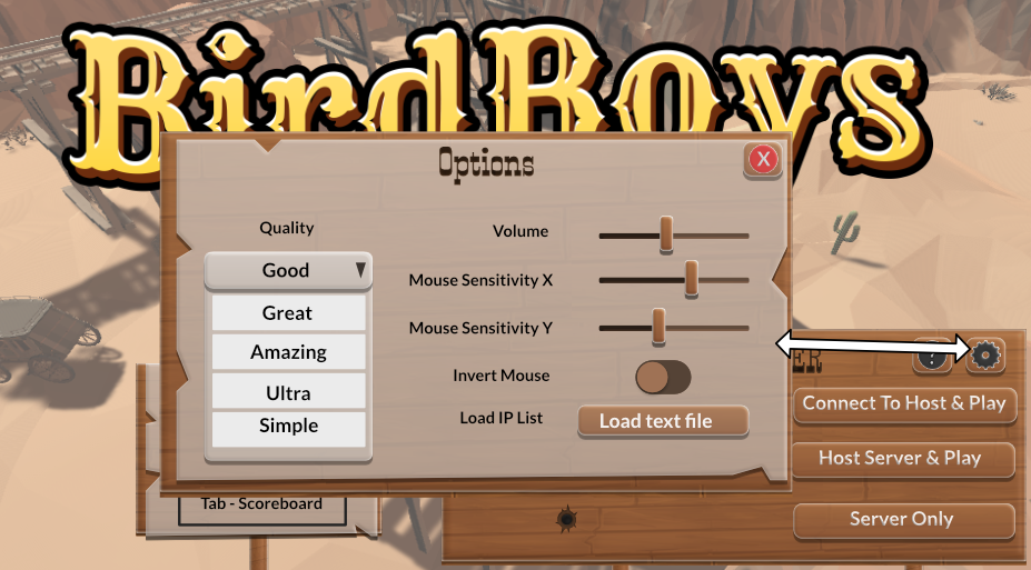
My thoughts on this was I wanted the center background to be the easiest to see, as the background changed a lot I didn’t want to cover it up. I can always condense the server stuff even further if I need to make it easier to notice the background. I choose a dropdown to handle server stuff because I figured that was faster to search then with other methods, but they could also directly type their IP as well. I’m sure someone out there is dying from OCD because none of the stuff below is properly lined up.
No, I didn’t have all the fonts picked out yet, I didn’t know what to do about colors yet either, I just wanted to get some ideas out there for now. I passed it over to the programmer for review, he thought it was a good start and I agreed with him. This is basically a bunch of boxes with a texture laid on the back, so it’s basically zero effort. The title I pushed through a logo template set I have, I’ll have to fix it later but it got the idea across. I decided to stick with the open source Rye font the programmer choose and added Lato which I thought was cute. (Obviously not as cute as bookman sans but that isn’t open source)
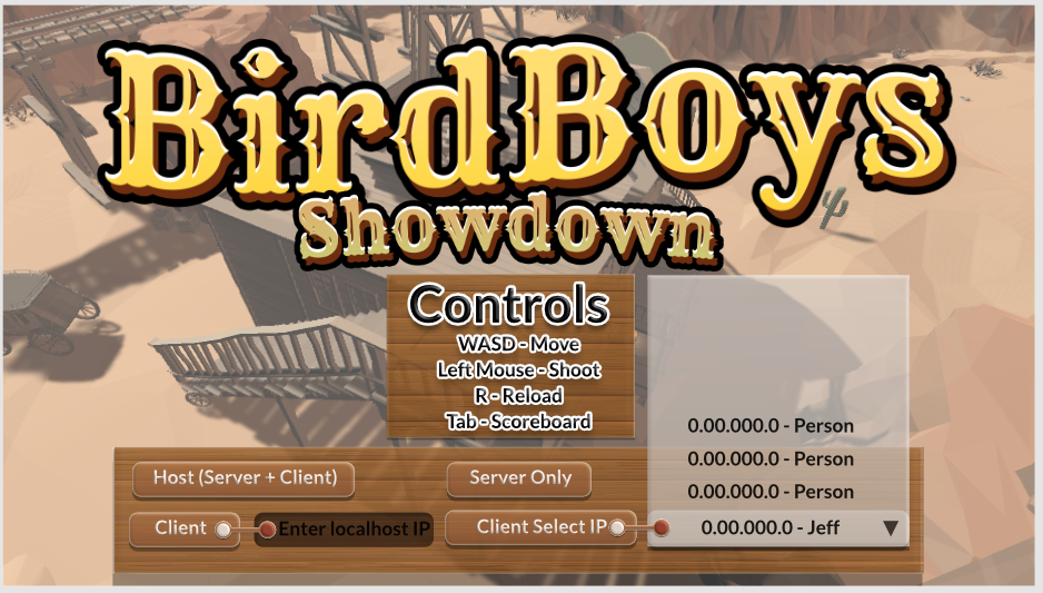
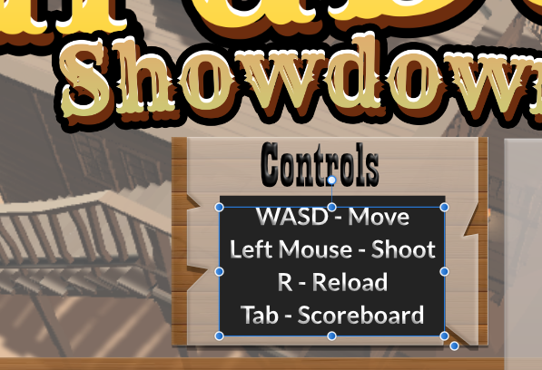
We talked about converting the Controls section over to a wanted poster for some visual interest, I thought that seemed like a good idea, but I would need another font for that. So me and the programmer looked for some open source fonts and I wanted something similar to Mircosoft’s Playbill. We eventually settled on Smokum, and I did some quick work on the wanted poster.

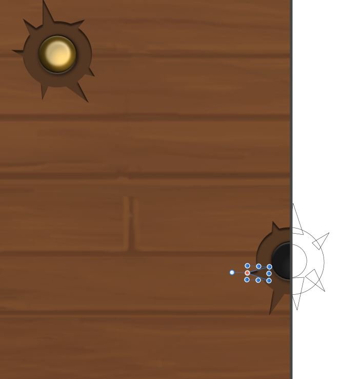
Well, from here I broke down some art assets I figured I would need at some point… Because I thought I’d do the easy stuff first. I made some wood and called it good enough and thought about what to do next.
But I was stuck now.. I needed a better way to handle input.
The programmer was pretty upset with this redesign and it’s understandable. He wanted me to condense the Client options, add another option and fix the flow. After some back and forth we eventually came to use this.
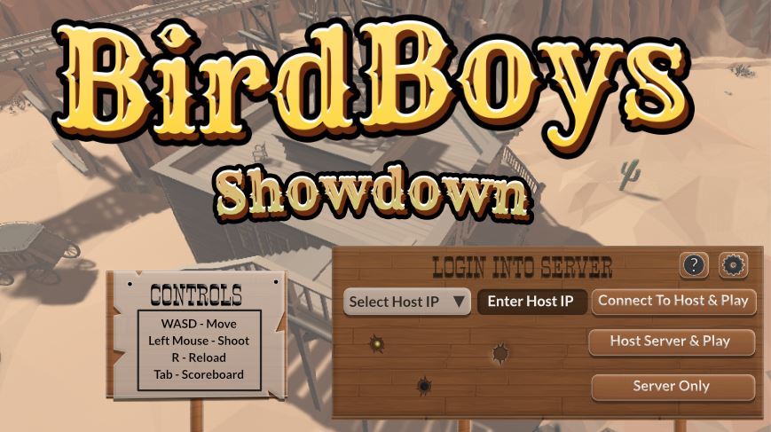
And that was the final mock-up. I added a few more buttons for later on in case we needed them. An Info button that would talk about server info (or anything else, sometimes I just make “back-up” buttons we can repurpose as needed) and an options button that would allow you to change volume, mouse sensitivity etc. I also added some bullet holes, some part way through and some actual holes. I also changed the text because I didn’t quite get the programmer jabber and tried to make the options make “more sense” since the programmer complained my labels didn’t make a lot of sense, I said his initial specs would not make sense to the average player so there I wrote it easier for the layman to get started.
Now I know dropdowns can drive people crazy, and perhaps there may have been a way to combine the input text field and dropdown field as they were combined -Some might call this a “searchfield” dropdown. I wasn’t sure if Unity allowed such an option (might be something we could code in though) and I also was not sure if it would be clear to the user what info they needed. The Select Host IP info would be coming from a text file of the users creation.
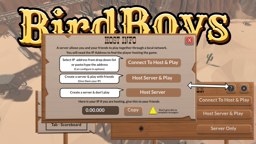
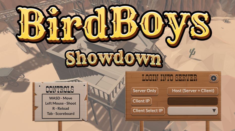
Above is a quick mock-up with a little more info on how to handle hosting, it will need some more work…
Anyway I’ll continue to update this post as I keep working on this. I’d like to show the in-game version later on, along with the rest of the menu’s….
To be continued…
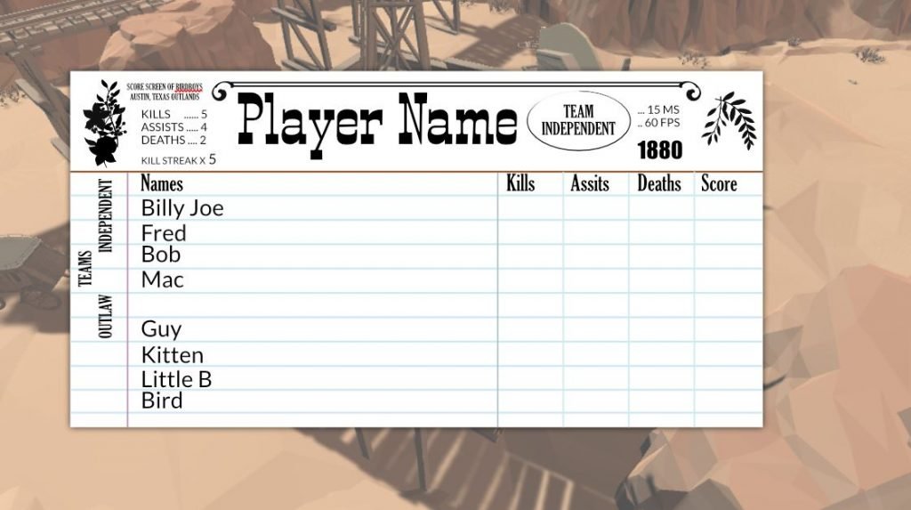
Score Screen
Originally with the score screen I wanted to use some icons to show teams so I created some icons and debated how they would look. Now, I feel score screen is not the right term, perhaps I should say current score screen vs result score screen. Because they are two different screens with two different priorities. I did briefly get them mixed up, with a results screen flashy icons make sense, with a current score screen they do not.
A current score screen should be small and out of the way as much as possible during gameplay, a results score should take up more space as it’s no longer during gameplay and allows the player more time to go through stats and think about the game.
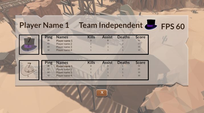
In the end though, I didn’t like the icon idea and thought about doing something completely different that I think fit the game style better. The icons were too realistic for my cartoony UI from earlier and I saw it as a style clash.
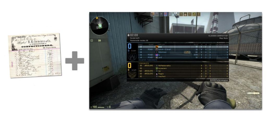
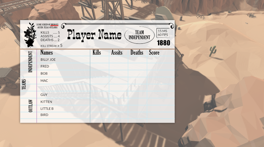
Using this method I would be able to condense the info better, and keep it fitting the style better, or at least that was my goal. Here was a quick draft I made an hour or two to send over to the programmer to ask his opinion on this direction. Man did they use a lot of different fonts on old paperwork. I know the general idea is to stick with one to three fonts, but that felt too simple compared to my reference art.
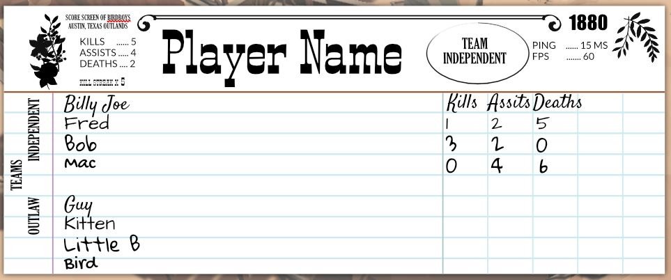
I whipped up an example trying to combine the best of both worlds. Yes, the graph would need another row, I’d need to make further adjustments on fonts, positioning and more but it gave me a direction to go in. The programmer liked it for the most part and we went over ways to improve it, mostly visually which I was not worried too much about. My main concern was can I convey the info well, and did it need to take so much space…?
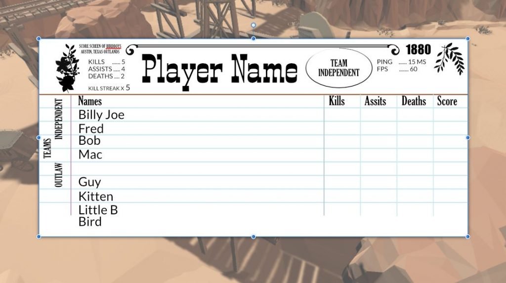
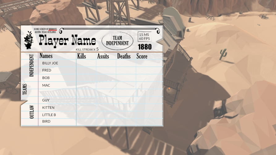
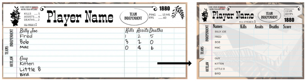
So after condensing everything once more I sent it off to the programmer for review. I wasn’t sure how I felt about transparency, on one hand it makes it easier to see players behind the screen, on the other, it doesn’t look as nice with those blue lines..
I was starting to hate the design (It was becoming too busy visually, didn’t feel playful either..) so I figured now was time for feedback.
This will be continued in a follow up post now. Stay tuned.