Understanding a little about fonts and typography can go a long way in describing how you think you text should be handled. Typography is often used to connect the reader to the words, and is important when thinking about the design and what you want to emphasize. Here is a quick overview of of some typography terms to get you started.
First what is a font?
A font is a graphical representation of text that can include letters, symbols, sizes, styles and sometimes even color. Fonts are stored on a computer and allow you to change how your text looks.
Before fonts were stored on a computer they were made of metal and were used to print text and other symbols on a page. A font was composed of sorts or metal pieces placed in a line on a composing stick to create sentences.
A collection of fonts is called a typeface or font family. Below is an example of different Imprint fonts in the Imprint typeface. Some Imprint font examples would include Imprint Regular, Imprint Italic, Imprint Bold, Imprint Shadowed and Imprint Shadowed Italic.

Font types
There are a variety of types of fonts out there. Here is a starting point for understanding some main differences, this can be split up further into another 15 categories, but the below should be enough for you to grasp differences in type.
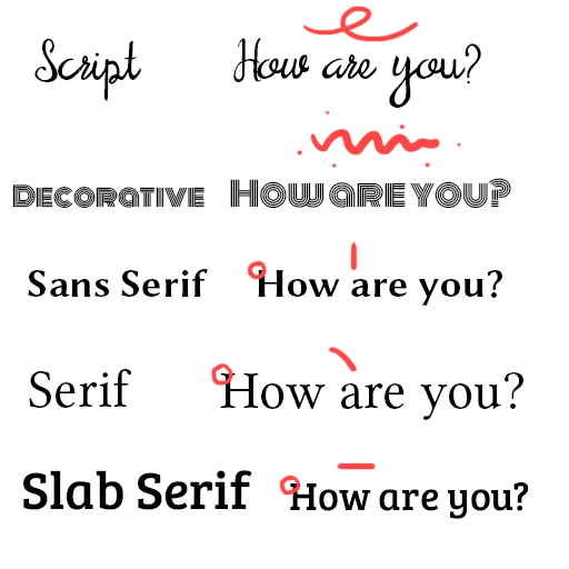
- Script – Personal Handwriting
- Decorative – Oddball text that can be a mix of styles or a completely new style
- Sans serif – Playful geometric text with no overhanging serifs
- Serif – Soft traditional text with curved overhanging serifs
- Slab serif – Blocky text with overhanging straight/angular serifs
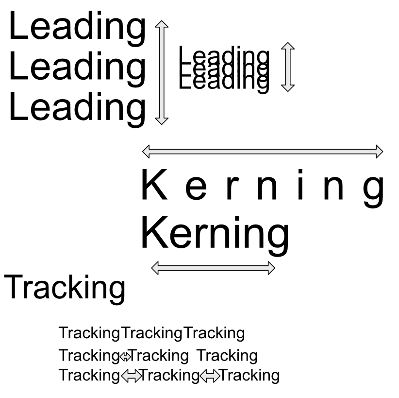
Spacing
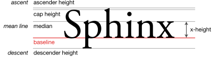
Sometimes text just feels off- a good layout will work to fix spacing issues. Leading is the space between each fonts baseline, you can use leading to fit more or fill out text paragraph height. Kerning is the spacing between letters, to focus on the letters spread them out. Tracking is the space between words, adjusting this can remove orphan words or even out a paragraph. Both kerning and tracking can be used to adjust paragraph width (and sometimes height if orphan words are hanging off the paragraph).
Types of font files on a computer
Before many font options existed something called Adobe’s PostScript (PS) was used to display fonts. It send the data for printing to a printer but was slow and and struggled with some fonts. Apple then stepped in and created TrueType (TTF) and it allowed a lot more freedom with font handling and no longer required the printer to handle the font data, they also created a fair amount of free fonts.
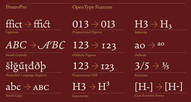
Adobe and Microsoft teamed up to create OpenType (OTF) a file type that extended TTF and added more functionality and storage in the font type. Some of the new functionality included Ligatures, Glyphs, Alternate characters and more.
In a nutshell OTF allows greater control and options for one font and is recommend for more advanced typesetting. You can see more options in software like Photoshop and can avoid installing 3-4 TTF fonts with 1 OTF font.
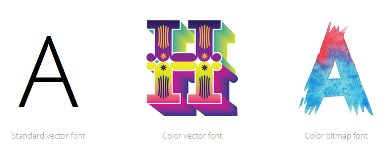
Another somewhat rarely used font file is a type called OpenType-SVG. It just has some additional color options/image options but not a lot of applications support it so I still don’t recommend it yet. It works fine in Adobe software but outside that it is problematic. The other thing is with so many new options it has it’s draw backs like certain fonts will be pixelated if at the wrong scale unlike traditional OpenType.