Hello there, I thought I’d share some of my favorite programs and why. This is in no particular order, just wanted to make a quick list. I’m a flexible designer so I’ve worked on a variety of projects and my tools reflect that. This post isn’t sponsored (considering half the tools are free and open-source) or anything just wanted to share some tools I really love.
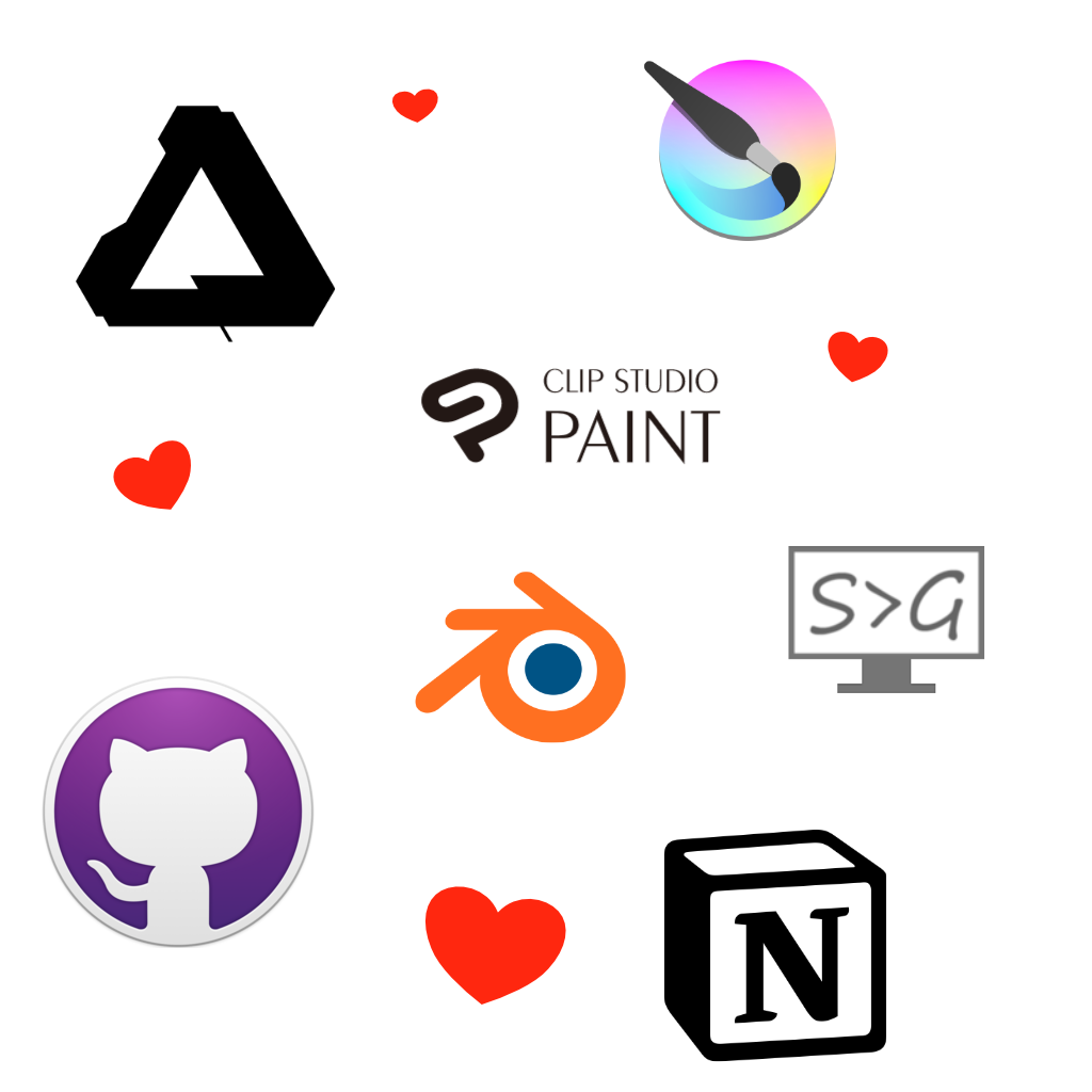
Here is the list if you want to quickly see what I’m covering.
- Affinity Designer – Vector software similar to Illustrator
- Affinity Publisher – Publishing & page management software similar to InDesign
- Clip Studio Paint – Japanese Comic Software (Supports 3D models, includes 1000’s of free assets, etc)
- Krita – free awesome digital paint app
- Blender – free 3D/2D modeling/sculpting & animation, video editing and FX tool
- Screen to Gif – record gif or videos with this free editor
- Github Desktop – The artist-friendly way to save your work
- Notion – Kanban boards, tables, lists, Wikis, blog posts, Notes & docs, math equations, websites all in one tool.
- Unity – For building games
Runner up tools would be Visual Studio Code, Reaper, FontForge, and well probably some other tools I can’t think of at the moment. I don’t really use these tools enough to add them to this list, but I wanted to give them honorable mentions as a code editor, sound editor, and font editor.
Favorite Design Software
Affinity Designer
A competitor to Adobe Illustrator, for one low price of $50 you can own this lovely software perfect for Vector design work or 2D artwork created from points and paths not based on raster pixels but perfectly calculated curves and lines.


Illustrator came out in 1987, and Affinity Designer 2014 (Windows version 2016) and despite the wide gap in years Affinity Design has caught up well and added features Illustrator with its bloated history has not yet received.
The most notable difference is Ease of Use, affinity design makes it easy to get started when working on a design. If you have a few hours you can quickly master Affinity Design.
Some features that Affinity Design has that Illustrator does not is wide file support. Affinity Design also has built-in Persona’s that allow you to easily combine Vector & Vaster images. They also easily allow you to switch a file into any of their software so if you have Affinity Publisher you can easily open up Affinity Design files.

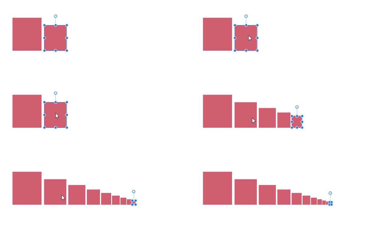
Affinity Design allows unlimited zoom, artboards, undo, and history snapshots. It’s very fast compared to Illustrator but is still missing a few key features such as tracing, mesh tools, blend and knife tools. The filters are lacking as well but for $50 one time vs $250+ per year, it’s worth the price. Many people compare it to CS5 toolset wise which is not bad. My favorite feature would be Power Duplicate which allows me to paste an object at different scales or rotations depending on the last pasted object using Ctrl + C to copy and Ctrl + J to paste with the changes.
Affinity Design alternatives would Inkscape, Illustrator and Gravit… But they just aren’t as good.
Affinity Publisher
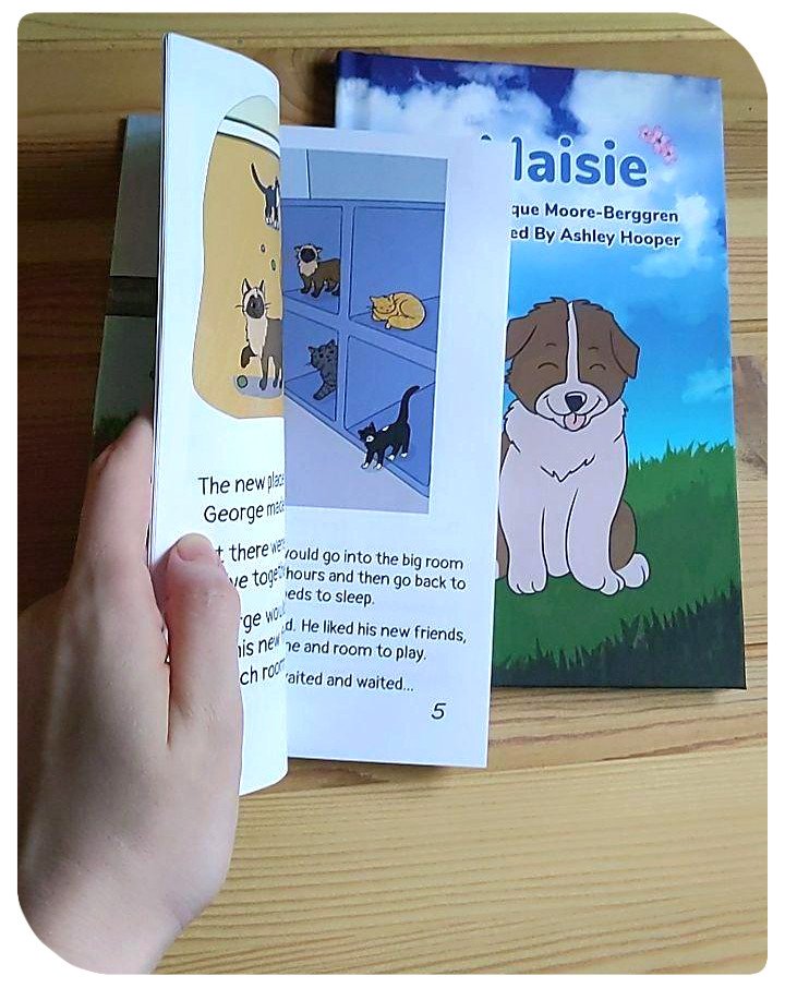
Similar to Adobe’s Indesign, Affinity Publisher is available for creating books and print material. It’s easy to use and works well with Affinity Design. I’ve used it to produce three books for print and recommend it as a quick way to work on print production and handle text specifically. It’s still missing a lot of key features but worked well enough for my purposes. Did mention all Affinity software has a spellcheck feature built in?

While I could mention Affinity Photo, I still have found Adobe Photoshop to be better overall and haven’t seen a killer feature from Photo that would make me switch but I hope in the future they find a way. I’d like to completely get rid of Adobe at some point.
Clip Studio Paint
It’s built for professionals. If you are looking for a tool that allows you to create comics, books, animations, or anything focused on illustration with a vector attitude this is the software for you. They have an incredible free & paid asset store (Also as an American, the store is super cheap! $20 will last you a good while), amazing brushes, backgrounds and other tools. I recommend this software for artists who are into animation and comics. The downsides is because it is a Japanese product be prepared to work out translating some stuff on the asset store, they have a button to do it for you, but when searching its still good to know to look for 枝 instead of branch as you’ll get better results with the former.
Check it out


Above shows vectors brushes, perspective & ruler tools (they have some amazing tools!), 3D models used to help aid with drawing (I mainly use them for background work) and page management. I think the page management could use a little work but overall it’s great, I use affinity publisher for better page & text management though.
Krita
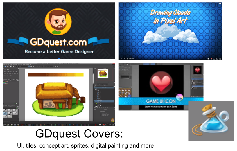
Krita is a great free digital painting & animation tool, it has a lot of special features not found in other art engines. What I use it for most would be it’s filters. It has both Internal and G’MIC filters. And those G’Mic filters! 500+ available filters! It also has the most non-destructive workflow for artists with so many different types of layer options. The reference tool it has is really nice, I wish other companies built something similar. It also has your standard Drawing Assistants, Full Color Management, HDR Painting, Python Scripting, PSD Support, Audio Support for Animation, Customizable onion skinning, and so much more!
I love the how the brush was built to be both a brush and eraser, the Brush Stabilizers are good, as is the Brush Engines, it also has a Wrap-around mode for creating tiles/textures/repeat patterns. 🙂 Great for game art!


Blender
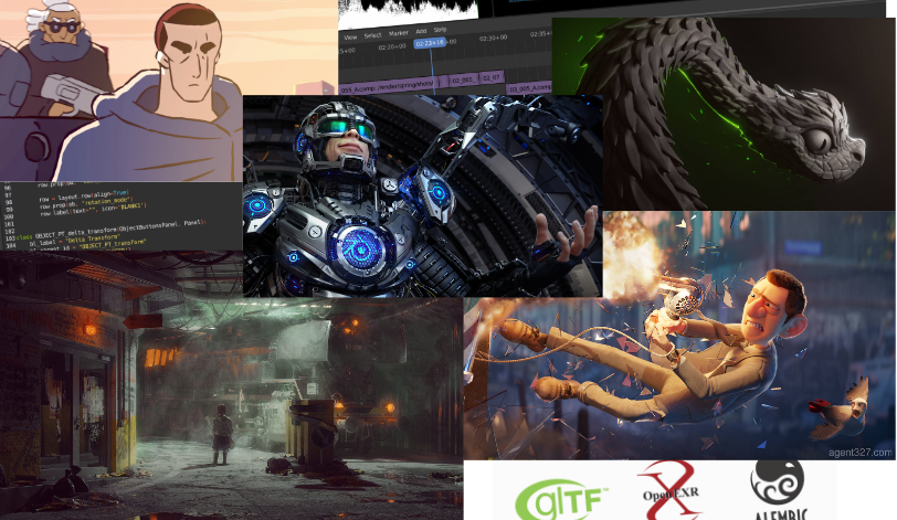
Blender an all in one tool – 3D modeling, Animation, 2D animation, Video compositing, VFX, Shaders, Sculpting, Python scripting, all in real time. No need to wait for rendering! Not with EEVEE! Super easy to use and work with.
If you have worked with other 3D modeling/animation etc tools, they made made it easier then ever to transition so it’s a great time to try it out now. I use it for a lot of different projects and recommend it if you want to get started with 3D modeling.
Screen to Gif
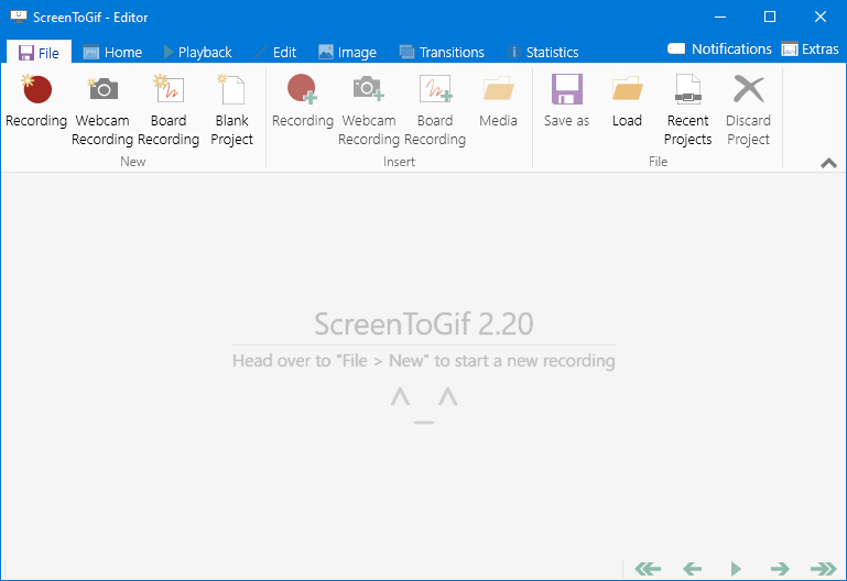
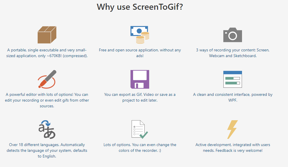
Easy to use free open source screen recorder! Check it out. I use this all the time when I want to quickly create a video or gif of my work and sent it to my client, my friend or whoever else. It’s very easy to use and I enjoy using it. Being free is also a big plus. You can record and edit very easily and I wish I could more software that was quite as nice.
Github Desktop
Yay! Source control! Once you understand source control you will never go back! Github Desktop makes it easy to get started. It’s great for working in games as you can upload your files, makes some tweaks, upload it to the server – realize you made a mistake and revert back. 👍 … Or you can zip up your file, make a terrible mistake, and unzip that last file you saved because you made a back-up the old fashioned way.
In all seriousness it’s like the ultimate undo button with comments and notes, the ability to use branches so you can experiment with files before committing them to the repository. And it’s simple enough artists can use this with Unity, or Love or whatever framework/engine/library you want to work with. If you find yourself hating Unity Collab with hair pulling wait times, you’ll love this, skip the wait, have a better history and work without fear!

Notion
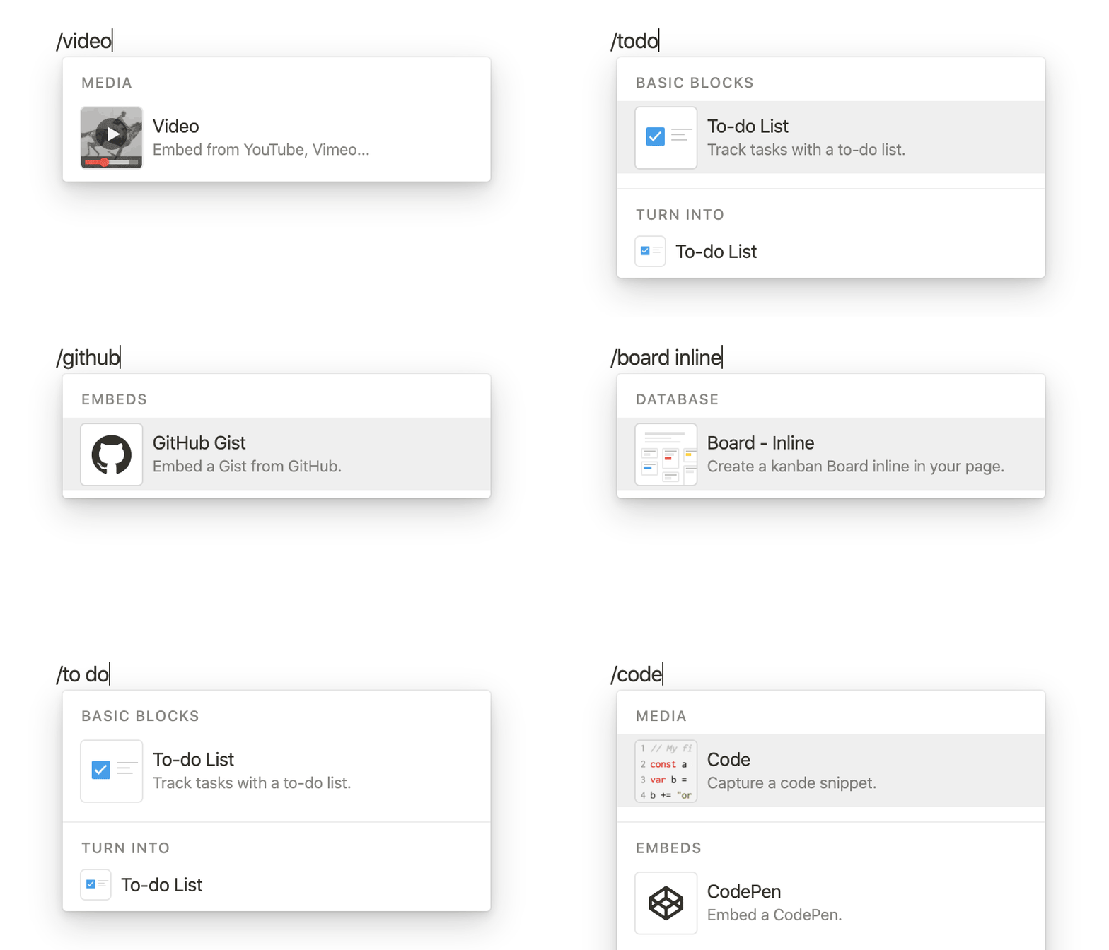
You want checkboxes next to your spreadsheets and an embedded pdf? They got you covered!
I like the whole Customize Everything part and the Embed your current tools and drag & drop and just the stuff everything in one spot philosophy. I also like the endless templates available… Not that I really use them much but I like that idea. You can use it for Kanban boards, tables, lists, Wikis, blog posts, Notes & docs, complicated math equations, websites and your own private recipe book.
It’s free but I ended up liking it so much I have the $5 plan for unlimited space.
Unity
My go-to game engine. Before I used Unity, I used GameMaker for many years. I loved GameMaker and it was built well for 2D games. I created art software in it and other games but it was limited in that it could not handle 3D very well. I started teaching myself Unity once I got to the point I wanted to understand 3D. I struggled. I hated Unity, in the beginning, I was overwhelmed with C# the first year but eventually figured it out and now C# is my favorite programming language!
I prefer Unity over Unreal mainly because it’s easier to program in right away and because it runs on low end machines better. If you are looking for something more high end Unreal would be the way to go, but if you just want to make Switch or Mobile games, Unity is better suited.


