

For those looking for a brief UI overview for small projects, a UI Stylesheet works alright. It’s not as fancy as a full on style guide but for smaller projects it may be what you need as you work out different UI ideas. If you are working on anything longer then 2 weeks, I recommend building a style guide or else you will very likely suffer.
- Having a style guide gives you a clear vision of why you made these decisions, this reduces debate.
- It’s nice to have a document to refer back to 6 months later when you aren’t sure what size this box was or what color you used on an icon..
- You have guidelines ready for if you add new teammates!
- I personally think the history of the design is an important aspect to add to the guide unless you can expect the specs and requirements to never change on the project.
- Creating a guide alongside with UX reasoning also helps you understand why your UI is laid in the way it is.
While working on Roguecraft Squadron (An RTS computer game) I went through many many many many different versions of UI. It was hard for me to see the big picture or what direction we should go in because the gameplay was not fleshed out all the way. Another issue was the speed of development. Originally this game was built in 3 days so the UI was choppy and very light. I didn’t know back then about better ways to think about development.
I did not know how to design for long term projects and that made designing UI very challenging.

I was thinking after the 3 day game jam, since we were so successful, we should continue development on the game. We continued to do so and did user testing at a local game meetup’s among other places. We would have people play and we would try to figure out ways to improve the game and make it more fun. While our user testing with formal experience was limited, we made the best of it. We would basically sit a user down and watch them play and ask them questions were they struggled.

I was still learning how to create UI during this process, and things such as 9 slicing. Since this was built in the LÖVE Framework it was much more restricted then something like as the Unity Game Engine that has a interface I can work with. While I could build designs, the feasibility of designs was limited because of time constricts and limits within the framework.
Now as I worked on changing UI throughout the process I realized had we just decided on a style and covered constraints early on it would have saved a lot of frustration in the process. Towards the end we ended up stripping out any fancy effects I had in mind and keeping it very basic so we could finish the project.

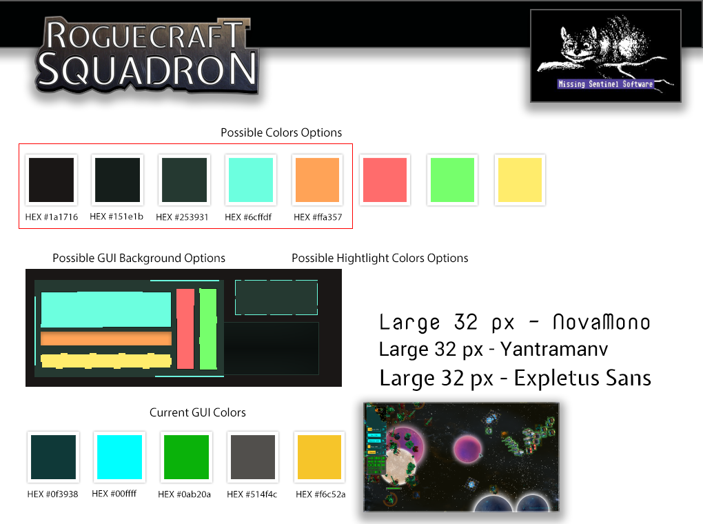
A stylesheet is a way to glance over all your visual elements so you can see if they work together. I can’t remember the original creator of the this PS stylesheet template but I liked the idea. It was a way to quickly compare elements and see if they worked together. A quick mock-up so to speak. The idea is to test colors, patterns, fonts and other styles together to see if they work together. You can then create different styles and compare them.

Well near the end as we decided to overhaul the UI to a simple version then I went about trying to make sense of the UI. At that point colors were random and did not work well together and things were becoming hard to understand, the other problem was we introduced new artists that didn’t understand our UI guidelines (Maybe because we didn’t have any then??) so the art we received was completely in the wrong style. If you work on a project for a few years without proper planning – original designs and plans get muddled. Sometimes the worse thing you can do is continue to try and improve something in your current direction.
What I would recommend if I were to fix this – Ask 3 important questions
- First separate out the elements, compare them to one another. Do the UI elements feel like they fit together? Do they all share similar styles, sizes and color schemes? What doesn’t fit? What does fit? Does spacing and size feel right? I feel that spacing and sizing of our UI could have used work. As the art we received from two new artists did not fit but I couldn’t argue that out of the project as it was already commissioned for and we didn’t want people to feel bad.
- Second, can you tell what the theme is from the color scheme? Why are the colors chosen? What is the meaning behind the colors? I think overall our UI colors worked but could have been more focused.
- Third – do the elements themselves feel like they belong with the rest of the content? (The game in this case). In the last version of our UI I would say no. The rest of the game is detailed, but the UI is strangely not. It doesn’t feel connected to the world in my opinion.
Using this process I believe we could have worked out a UI that felt better connected to the game.
There were numerous time constricts with the design and what the programmers could do so sometimes you just have to let it go and just find doable fixes the programmer will okay for your deadline.
If you want to see behind the scenes on some of the ideas for the UI why not look at the notes on GitHub?
Here you can see the crazy design process on RCS. Design is messy, frustrating, and getting a win like getting the programmer to add a UI back button can really feel like a victory (I mean I really fought for a back button on all the main screens, it was like not until we were going to release 2 years later we added one).
Here you can see my journey of learning how to write better tickets, create better designs, and figure out better project management. Lots & lots of mistakes but I slowly learned how to improve. Not everything is here but here are a few examples of stuff I’ve worked on.
- Redesigning the game mode screen.
- Resigning the game mode screen P2.
- Designing UI ship actions
- Designing a score screen (Never made it into the game)
- Changing menu backgrounds (I just thought it would be cool, and a way to invite players to check out our booth)
- Cursor changes
- Mission UI (Yeah… Pretty terrible wireframe attempt in PS, this was before I knew about wireframe tools)
- Server screen designs (All over the place, but it did end up sticking a little)
- Unused cursor assets I designed (didn’t end up fitting the style anyway)
- Unused dialog text box (didn’t fit anyway)
- Designing some icons
- Exit lobby button (I mean this is basic UX right??)
- Designing minor tutorial changes (mostly UX changes here)
- I like to condense info when possible (It changed quite a lot but is better then it was)
- Fixing text on buttons
- fixing more buttons
I never claimed to be a good designer and I sure learned a lot over a few years working with designing screens. What I learned most of all is…