Getting started
Hey, I thought I’d make a very brief tutorial on creating a font in fontforge, for more advanced tutorials I highly recommend this kid on youtube.
To get started install fontforge. Now by default FontForge wants to open a font, but today I was going to cover going over a font from scratch. It’s still a good idea though to start with a base font then modify from there, but for today only I was going to cover some of the most used characters.
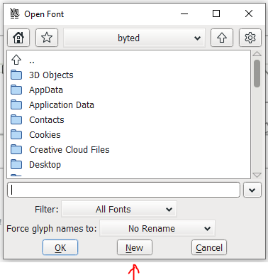
Hit New to Get Started
I started a font with the New button instead of opening a font. You’ll notice the first 32 characters are strange looking. I’ve marked them below.
Font sections are divided into 3 parts or more.
The first few characters in a beginning of a font are reserved for font formatting and other functions; they are called Control codes. These characters are used to check when a file ends, how to handle backspaces, what to do if the font errors out etc. They are basically directions so anything that wants to use this font knows how. For a little more info you can look at each characters function here.
The 3 parts to a font are control codes, basic Latin, and a supplement

Now the next thing I’ll point out is this font is encoded to be a generic Latin based font, if you wish to use a different language you can change the encoding to some other format. Changing the encoding can change the basic latin and the supplement characters/symbols included.
Encoding > Reencode > other code option
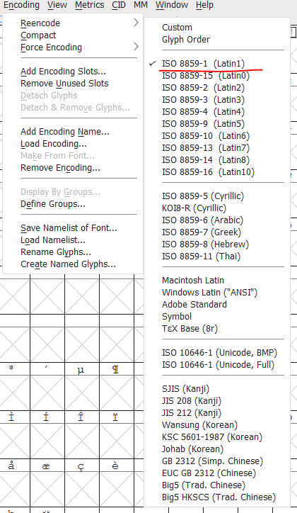
No manner what you form of Latin you switch to, your basic Latin (The top section) will remain the same, the bottom section will change depending on how you encoded it. Switching to encoding to some other format outside of Latin such as SJIS (Kanji) will also change some characters in the basic Latin section.
If you need to use a particular character or language look for it here and ensure you have the correct encoding.
Now your big focus should be on the most used characters, in this case Basic Latin (the top section), the supplement characters aren’t important unless you need special characters such as ©, ±, £, ½, Â for example.


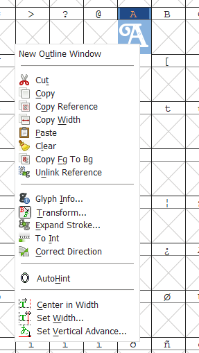
Creating a character
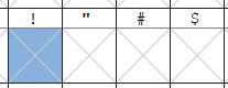
Find a character and click on the box below to work on modifying it. If it has an X in the box it merely means it is empty with no data. We’ll need to start filling this in.
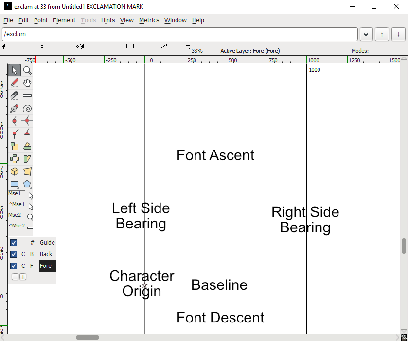
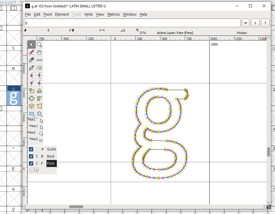
Here is the Outline Glyph View, this is where you will be able to edit or add glyphs.
Let me break these terms down in real simple terms
- Font Max Ascent Line – The highest point of the font, anything above gets cut off or starts to overlap another another character
- Font Max Descent Line – The lowest point of the font, anything below this gets cut off or starts to overlap another another character
- Left Side Bearing – Anything further left gets cut off or starts to overlap another another character
- Right Side Bearing – Anything further right gets cut off or starts to overlap another another character
- Baseline – This is where the base of your character sits, characters like Y or G will often have descenders that fall below a baseline.
Importing an SVG
One of the nice things about fontForge is it allows you to easily import SVG, bitmap and other file types you can use as a font. SVG or vectors will be clean and clean nicely, other file types may cause other issues.
To import an SVG you can go to File > Import and select the file where ever you left it last.


You can adjust the bearings by clicking and dragging them, this removes unused space.
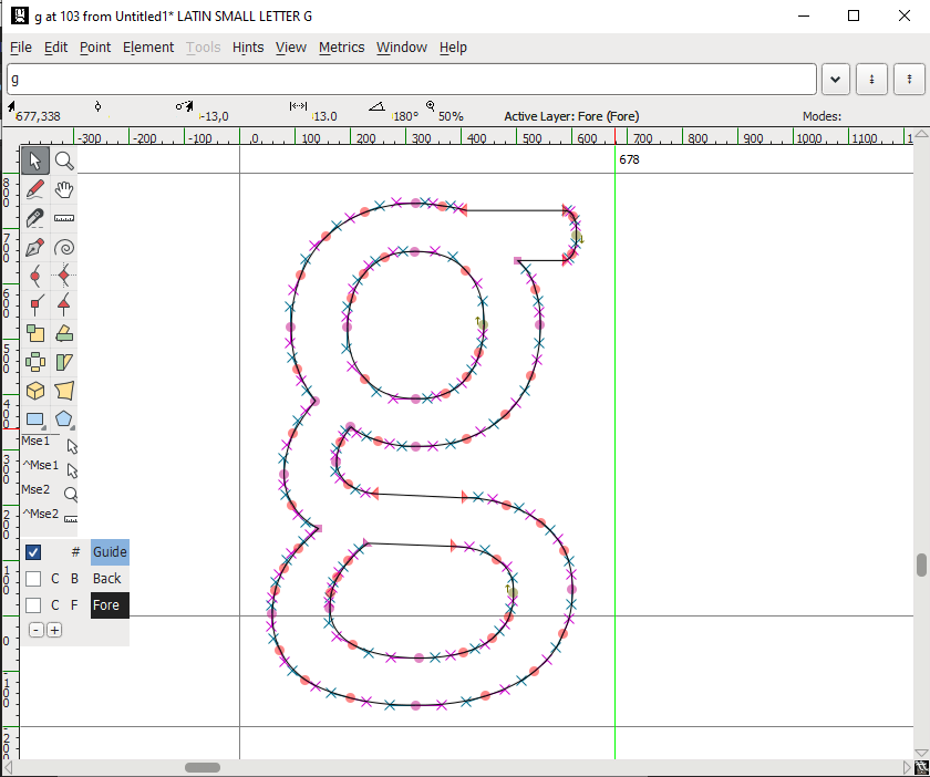
Quick drawing help
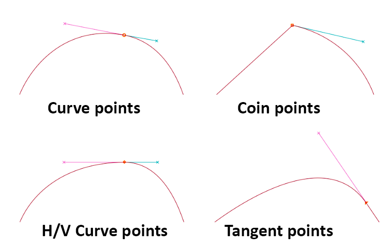
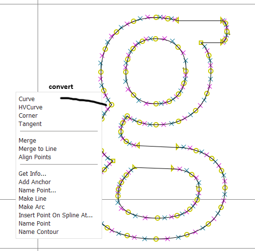
Now if you want to create your own character I won’t go into a lot of detail but will give you some pointers. A character is full of points, these points can be made into different types of points- Curve points, H/V Curve points, Coins or corner points, Tangent points. These different types of points change what you can control on a curve. You can check out the manual for more info.
Try to click on a point and drag it out. The o’s are a point and the x’s are an anchor used to control the point.
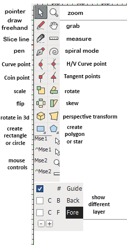
I’m not going to go into what these tools do. Experiment and play with them. But let me go over three more important points.
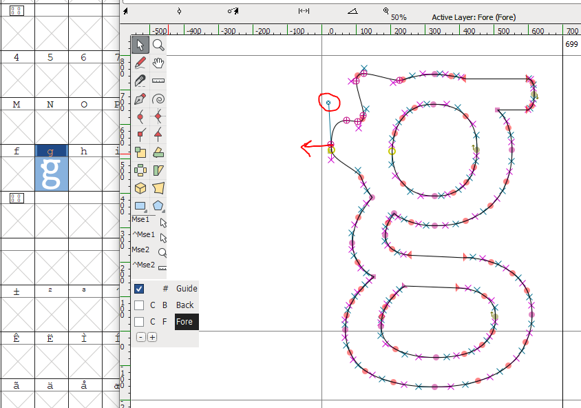
1. right click any point to convert to a different type of point.
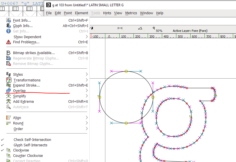
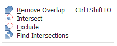
2. Go to Element > Overlap to change how shapes are combined or intersected
3. Check what clockwise direction a shape is facing to see if it’s visible. If it’s the wrong clockwise direction, it’s invisible.
Extra tidbits – Coping & Pasting Glyphs
You can copy & paste letters really quickly just by right clicking and pasting on letter and selecting a place to paste. This also a quick way to clear glyphs too.
Extra tidbits – Changing ascent/descent lines
You’ll notice the Max Ascent Line and Max Decent line can’t be dragged as this applies to all characters. To change this you’ll need to exit the letter and return to the main screen from here go to Element > Font Info.


Extra tidbits – How to prepare an image for import
Some quick things here, the default max height for a character is 1000 pixels. Width doesn’t matter as much as you can adjust the bearings easily but a good starting point is creating a file 1000 x 1000 pixels in whatever software you choose – be it Affinity Design, Photoshop, Illustrator, Krita, Inkscape etc whatever.
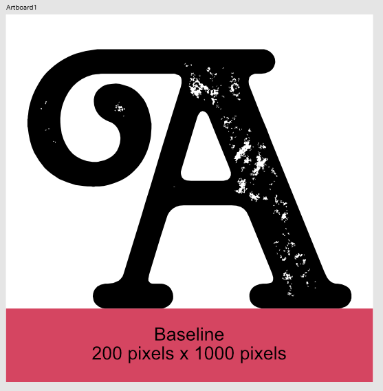
Your baseline is general 200 pixels from the bottom of the image. You can use a rectangle for something as a guildeline and just remove it when you export. I’d probably start with an open source font from Google fonts, free and open source is a great starting point.
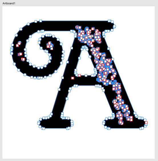
Here you can see the character imported after the letter was converted to curves in Affinity Design.

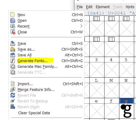
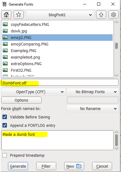
Extra tidbits – Exporting a font
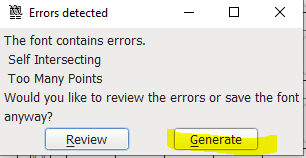
You can quickly export a font with File > Generate Font.
As long as you don’t have any big errors this should be fine.